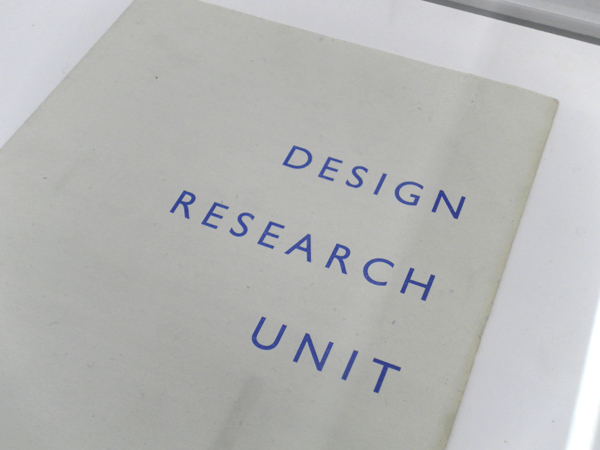
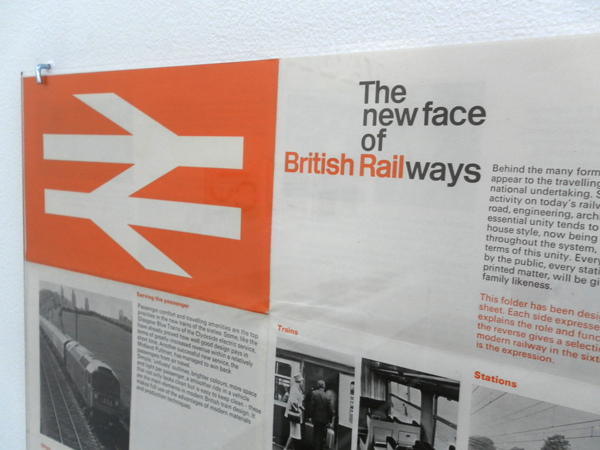
I went and saw the Design Research Unit (DRU) show over at Cubitt Gallery in Angel this weekend. I'd shamefully never heard of these guys but they were the original post/multi/trans disciplinary guys. Working over industrial, architectural, advertising and graphic design they were formed in 1943 (cheers Wikipedia). They have impeccably designed material which covers branding for the likes of ICI, Ilford and the legendary graphic system for British Railway. (Which always reminds me of Roundels equally legendary rebrand for Railfreight in the 80s). All of this belongs to a style of solid, accurate and robust design who's strength comes from not just the flawless work but also the consistency of it's application. The guidelines they lay down for the brands are exhaustive and particular and you get a real sense that the brands they created are successful through the rigour laid down by their creators. It is in contrast to the work of one of today's branding forces: Moving Brands. Their offer is based on their brands adapting to different situations and responding to it's audience. This is great for today's twittered up social networked scene but I don't know that it necessarily creates the same kind of well loved, iconic and long lasting work as the commanding and authoritarian brands from DRU. I suppose it has a lot to do with different times and approaches- DRU's work is not very sympathetic to the contexts it's applied to- it imposes itself but then as time passes it's audience grow up with it and it becomes more comfortable. With MB's work it is more immediate and welcoming but perhaps more transient- it will be interesting to see what from the brands created now will still survive and be as iconic 50 years on as British Rail. Perhaps the best name for a design practice ever:
The show is a traveling one and I loved the display which was on very functional and beautiful Dexion racking, mmm:


