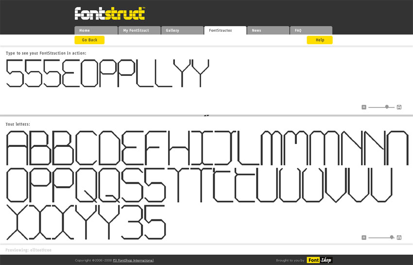
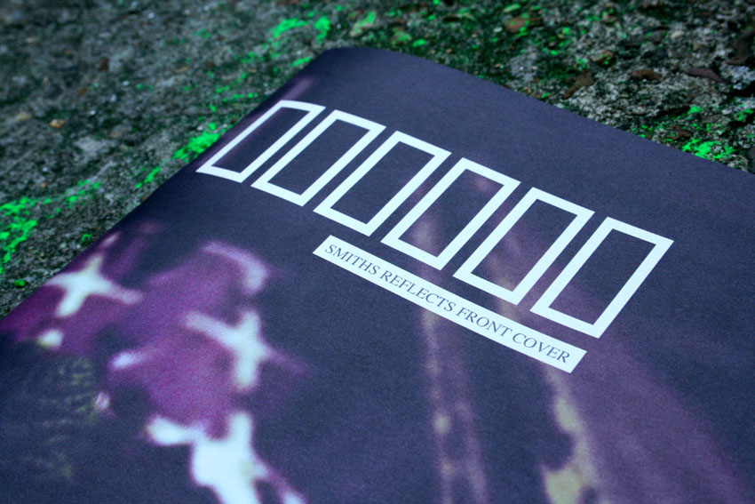
I found this website/tool recently, its only been around for a couple of months so i feel I'm riding a new typographic wave. It is seriously kicking my ass. You can make modular fonts rapidly in a web browser and share and download them. It's a great piece of equipment for a designer who's had loads of font ideas hanging around waiting to be made. I'm not sure as to it's true potential- at worst it's the best procrastination device ever- at best it enables designers to effectively, creatively and cheaply create fonts that can be used. I can see it being a fantastic thing for schools: it is so simple and quick that it could help inspire a passion for type in 'the next generation' of designers. Overall you should check it out- it's something a bit special. http://fontstruct.fontshop.com/
Berlin
I came back from the Berlin 'DMY' Design Festival with a few of realisations: helvetica is beautiful, German words- i.e. lösswasserspeisung are fantastic- so long and so much fun to say- i might start joining words up more often, and the notion of celebrity design, and designers is whack: Tom Dixon exhibited and Karim Rashid spoke at the Bombay Sapphire Gallery and both made me shiver in a bad way. Berlin is different to any other city I've been to. It doesn't seem to have a distinctive heart, there were some roads that had more stuff on than others but still it was easy to walk miles without much happening. It did however, make for a very relaxed atmosphere and the space itself was really open, wide roads and spaced out buildings etc.
The design festival was a bit underwhelming to be honest but the each bars, sweet book/print shop, tiny galleries and cheap tasty falafel made up for it. It was nice to be out and about but it made me glad that i was in London- design wise it doesn't get much better.

Hot Off The Press (well ish)
Hang on...
Actually there was one embarrassing moment, right at the end of the interview where he asked me who my favourite graphic designers were and i somehow clammed up and said erm erm erm you, and erm erm erm Build... and i couldn't think of anymore. So i had a think and thought i should post a list or images or something to remind myself of the awesome stuff i like. I dont think i have favourite graphic designers more like favourite projects and some favourite projects are by the same company or person because i have three favourite design projects- only one of which i graphics. I dunno- here's the list. (not extensive- enough for say when someone asks you in and interview) (of graphic designers and projects) (in no order) Stefan Sagmeister, particularly the Anni Kuan project http://www.sagmeister.com/work2.html
Build http://wearebuild.com/
The book A B Z more alphabets and other signs 

Bibliothèque http://www.bibliothequedesign.com/
This old map of bus routes around Brighton

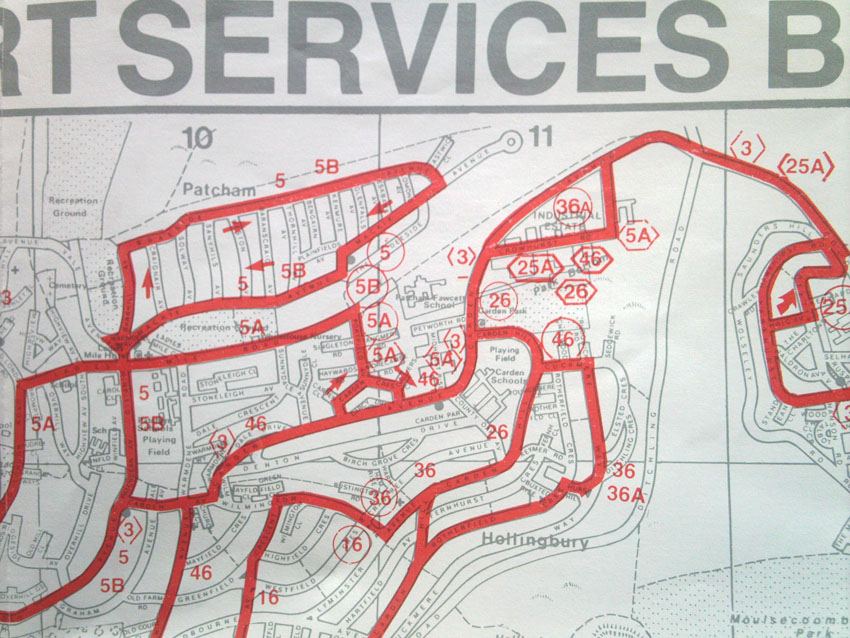
Buro Destruct, particularly the BBD Designer screensaver http://www.burodestruct.net/bureaudestruct/bddesigner/index.html
Spin http://www.spin.co.uk/
Iwant, particularly the Youssou N'dour sampler and Tracey Thorn Project http://www.iwantdesign.com/iwant2007.html
Non-Format http://www.non-format.com/
Bibliothèque Interview
I managed to score an interview at Bibliothèque yesterday which was awesome. But the interview didn't go so well, the guy who was interviewing me was Mason Wells i think. This blog isn't any kind of get back at him, or argument or anything it's just supposed to help me clarify my thoughts- he gave me a lot to think about and i felt like it required or deserved some sort of response. He was this incredibly rigorous and pretty intense graphics guy and he wasn't really into some of the projects in my portfolio, mostly the goldsmiths stuff- he didn't like the lack of a clear logic and seemed to want everything to be graphics- i.e. he couldn't see why for a wayfinding project i hadn't designed a graphical system of signs. Which i guess is his thing but from my point of view Goldsmiths would have probably kicked my ass for designing 'just' a graphic system- it's just not quite what they're about. Another thing seemed to be the lack of application or clear problem solving nature of some of the projects which i would argue was partly to do with the briefs set. He pulled me up on some of my typography too which i hadn't even seen- he had a mad graphics eye- and i mentioned that it was hard to get better when i didn't really have that kind of tutoring- (i.e. please give me a placement and I'll learn!!!) but he suggested that maybe i might want to change courses- which seemed at the crux of the difference between his way of doing things and my portfolio- i like being at goldsmiths and i like doing loads of things which aren't graphics, as Victor Papanek points out- the best way to survive change and also be the most rounded designer you can is to be a generalist. I'm not saying I'm a jack of all trades master of none but i think i might not be specialist enough for the Bibliothèque school of design. The whole interview made me really be self critical and i think I've come up with some responses to Mason's criticism: my work needs to be more clear and logical- i realised that my projects get way too complicated and the ones which are the best i can describe fully and succinctly in a paragraph- i need to have more projects in this vain. I want to keep being a 'generalist' especially for now when I'm learning all the things that are going to keep me afloat for the next few years or so, but i do want to get better at typography and do more graphic design that's relevant and logical and ... I want to have better conclusions to my work- research is great but conclude it somehow- and if a project has an outcome go all the way with it- to work through a problem more thoroughly and to not have to finish half way because of time- work simpler and faster- get less concept heavy where i don't need to be and to know when to stop thinking, and i guess to know when to stop doing and take a look at how i might progress a project.
All in all it was a good experience and i don't think i embarrassed myself at all, and meeting with Mason and seeing how clear and passionate he was has made me want to work for them all the more. We'll see how the summer and next year turn out i guess.
My Business Cards... finally
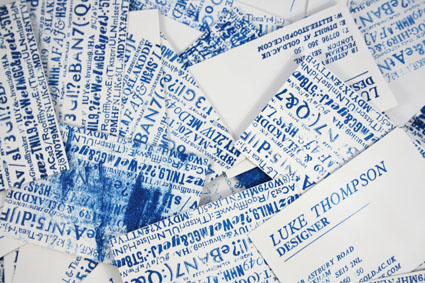
So thought i'd put some of my spare time to good use and learn to use my Adana: a small printing press with all the lead type trimmings- it's an awesome machine. Anyway, i thought i'd make some business cards and once i started i couldn't believe how long it took to typeset, print and crop them all. I was at it for nearly 2 days but now i know all my 20 fonts initmatley which is nice. The nice thing about hand printing every one is that you can vary the effect to create really layered typographic images.

