Feral: Shifting Baseline Syndrome & Trophic Cascades —

After writing this post I found a Ted video of Monbiot explaining what I wanted to in a much better way. So you could watch that instead.

I’ve just finished reading Feral by George Monbiot. It’s an articulate, intoxicating and inspirational read even if points are, at times, a little simplistically or evangelically argued. He advocates for rewilding as a method of more holistic conservation than simply maintaining what already exists. He argues passionately for how this could create a more imaginative, thrilling, economically and ecologically advantageous environment.

There were two particular ideas which I’d not come across before that seemed so logical and exciting that I wanted to write them here to remember:

The first is Shifting Baseline Syndrome. This is what happens when conservationists (or policy makers or whoever), seek to effect a change to put something back to the way it was, believing that this ‘before state’, is not just an acceptable scenario, but that it’s the best it could be. Monbiot uses fishing as an example of how people’s reference points move. Current fish stocks are being measured against their 1970s population, this however, is already a substantially reduced position and doesn’t provide a good reference point for the best case scenario, (which for fish populations was sometime before modern commercial fishing technology got involved).

The second is the idea of Trophic Cascade. When deer graze they eat and kill lots of saplings and would-be trees that don’t get a chance to grow. You end up with treeless grasslands, or similar monocultures that don’t provide the kinds of habitats that encourage a diverse flora and fauna. This is not good as trees are brilliant for everything it seems – from creating better soil conditions, to providing dead wood habitats for thousands of creatures, and helping to prevent flooding by helping with soil erosion and rain run-off. This situation has arisen over decades of human influence that’s squeezed out top of the food chain predators. What happens when you reintroduce these predators (think wolves, lynx etc.) is that the browsing animals begin to get eaten and so are reduced in number, limiting their effect. But the more interesting thing is that it alters their behaviour and how they eat. Rather than being allowed free reign the deer are more cautious, and so don’t hang around the river where they are in the open and are easy prey. This allows plants that would have previously been eaten to grow up around the river, leaves fall into it, which increases the ecology of the river and also provides shade. All these factors encourage shrimpy creatures and subsequently the eels etc. that prey on them. So everything is connected and can be altered by relatively smallish tweeks at the top of the ecological cascade.

This reintroduction of predators is currently being played out in Wales where they’re looking for people to let Lynx on their land.

And if that’s not far enough the Long Now project: Revive and Restore is looking to take extinct species (so completely gone, dead and not here anymore), and using Jurassic Park style technology genetically modify and selectively breed back a range of animals. Their key specimen being a Woolly Mammoth! Brilliant talk by Stewart Brand about this here.


Pitt Rivers Museum

The Pitt Rivers is different to every museum I have ever been to. First things first- you have to go through another museum to get there. That's beautiful to start with, a journey through the Oxford Museum of Natural History is a great thing in itself and a stone archway opens out onto a tall (3 or 4 normal stories high) squarish room which is just packed with cabinets and cases and exhibits.

When the Lieutenant-General, Augustus Henry Lane Fox Pitt Rivers gave his collection to the University (c1884) he specified that the museum should be organised by typology rather than the usual topographical or chronological systems museum visitors and curators are used too. This important distinction is what gives the Pitt Rivers it's character and feel.

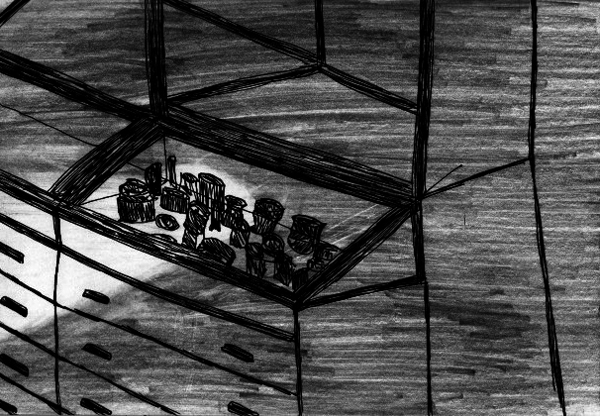
Another fantastic thing about the museum is that a lot of the objects are on show, rather than hidden in an archive. As Pitt Rivers said "It is better to show three objects rather than one". You can see everything. As this is the case the cabinets and display cases become very crowded- this is again to do with the typological organisation of the exhibits. Because many of the objects are delicate the light is low and visitors have trouble seeing objects placed at the back of cabinets, or underneath shelves. However visitors are encouraged to carry torches (available for loan at the gift shop), to be used to hunt down and observe the reluctant, hiding objects.

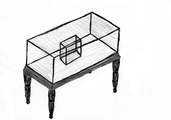
Every space is filled with exhibits, the cabinets stand proudly in the middle of the room, underneath and around these are drawers which are all searchable by the visitors. On the walls more cases and drawers below and cupboards and cases above reaching up to the ceiling out of reach and almost out of sight. Some of the cabinets even have other cabinets inside them. All of these objects are made from dark worn wood, giving a very comfortable and academic feel, and opening a drawer and discovering a cryptic exhibit is thrilling. The objects in the displays have handwritten labels, often on the actual objects themselves. This unusual cataloguing system seems to say that the objects themselves are not that precious and that it is more important that they are here among everything else, as if what they represent rather than the object itself is the focus of the museum. Very pragmatic.

Whilst Pitt Rivers did do some collecting first hand, most of his acquisitions came through other people: anthropologist, ethnographers, archeologist, soldiers, auction houses and friends. Of course the museum came about through his passion, interest and not least, wealth, but I like the idea that he became a hub of collecting so that people would have him in mind when they saw something they might think it suitable for his collection. People coming to him with offers rather than him hunting them down. Another interesting point to make on this topic is that only 7% of the current collection is made from Pitt Rivers initial donation. That means that thousands of exhibits have made there way to the museum since then, It links nicely to a theory I have about how a collection will often act as a sort of magnet for other similar items.

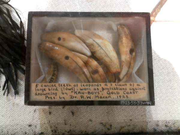
In terms of the specific objects I enjoyed included the famous shrunken heads, the swords (I am boy after all), the human heart in lead 'heart' shaped container and the Greenland Tupilak figures. If I'd had more time there I'm sure there would be more on this list.

The effect that the Pitt Rivers has is profound. The subtle differences from other museums create a warm, cosy, intimate and personal space which is absolutely packed with character. Idiosyncrasies are embraced and celebrated- so what if the displays are packed so full you can't see all the exhibits? Come on one of the night visits and go around the whole place in torchlight and enjoy the feeling of discovery. The place is a riotous excess of pluralism and the 'other worldly' quality it has is giddying. The museum is montage rather than maths, feeling rather than fact and by placing so many different types of exhibit from so broad a reach into such a small space and into such close proximity it allows for wonderful random encounters and associations. At the heart of the Pitt Rivers though is a humanness which pervades throughout. A case full of oil lamps or travel charms shows how different people at different times came up with very different solutions to the same problem, it is this glorious juxtaposition of difference and sameness which the Pitt Rivers basks in.

Pitt Rivers Museum Link: here

The Museum of Everything #3

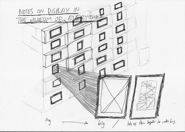
Me and my lovely girl popped over to the Museum of Everything over in Primrose Hill today. I had high hopes after last years first show which was brilliant (see old post here: post!). The pictures above are a sticker you get on entry and a sketched version of, what for me was the most interesting hanging space in the whole show: a narrow corridor with breeze blocks hung with small frames holding small postcards. There were also large blow ups of some of the postcards (about a1 and bigger) which was a nice play on scale (a recurring theme), and also some large pieces made up of lots of small pieces (I know what I mean but maybe the picture will help if you don't).

Firstly, as I say, I had high expectations and one of the things I didn't like as much as last time was the use of the space and the route they took you on through it. I have vivid memories of being guided through a minor labyrinth of small spaces and corridors to come to an opening which gave onto the top of a set of stairs and an enormous double or triple height space, the walls of which were covered in work- proper salon style. The amazing feeling of unexpectedness was really special to me, this time we were guided another way through the space (which had been reconfigured slightly anyway) and that moment of awe wasn't as poignant as it had been in the first show. Also the contrast of small rooms and corridors to large spaces wasn't as apparent as it had been.

Having said that the show still threw up the strange 'grotto' like environments which characterised the last show. Shells adorning an entire room reflected the obsessive nature of the collector and the room with the homemade miniature fairground which was animated 4 times an hour intoxicated as you waited for it to come to life and then left you with a childish giddyness 2 minutes later as it died.

The weird lighting made the badly placed plaques really hard to read but fortunately most gave little added information to the work. There were a few that felt right. One story about a screen that Sir Peter Blake had bought told how he'd purchased it rather than a roomful of stamps. The story left you not regretting that he hadn't bought them but you did want to see them, and I suppose it was more that you were intrigued by Peter Blakes' character rather than anything else- what decisions informed his choices and also wondering at the opportunities that were presented to him- who else is offered the chance to purchase a room full of stamps. Fantastic.

The light however did give some dramatic shadows which were really great but unfortunately couldn't be documented due to the 'No Photography' rule. This would have been fine but there was no affordable catalogue or any exhibition view postcards. (As you can tell I'm more interested in the display, feel and curation of this exhibition which often isn't documented in the 'gift shop' at the end. I don't like organisers and institutions to govern the visual 'memories' I take from a place.)

Now onto some of the work shown. Walter Potter was a taxidermist and he made dioramas of scenes cast with stuffed animals. The interesting thing about his work (other than the 'freak' 2 headed lamb and 3 legged sheep he taxidermied), was the use of scale it employed. In one scene a doll's house was used in place of a real house, makes sense. But then a normal cat cannot inhabit the same world as the scaled down house. In it's place a kitten is used, and puppies and baby mice and an assortment of infant creatures who themselves are strangely proportioned when compared to their adult forms. Then there is a cockerel- and here Potter used carefully selected and positioned feathers from an actual cockerel on a small former. Likewise a cow, even in infancy, is not the correct scale for this scene and so calf skin is stretched expertly over a cow shaped frame to produce the correct effect. This range of skills, techniques and real and 'fake' creatures leads to a crazy scene of miniaturisation and freakishness. I'm reminded of a quote from Calum Storrie ('From Soane to Soane' in Inventory Vol 2, No. 2, edited by Neil Cummings (1997).)

"Each railway station, car, gun and doll's house shows us our world made small. Of course by juxtaposing different scales of object this world is made absurd. So what at first, appears as a way of simply relating to the world (especially the world of made things) is actually a mad tableau which defies coherence."

I also really enjoyed how personal and intimate the whole Museum feels, the hand crafted feel reflects the outsider/folk art which it exhibits. Here I should give a nod to This Is Studio, who created the branding and graphics for the show- lovely stuff. Link: thisisstudio.co.uk. There is no getting away from the humanness of the show. The Museum is very accessible and welcoming. The curio/ freak show aspect of the work shown arouses the voyeuristic tendencies in us and, as the introductory panel encourages you- it's about the experience of it as much as anything else. Certainly as you enjoy a cup of tea afterwards you feel like the tip through the varied rooms, corridors, spaces and types of work was similar to an hour and half tour through the human mind.

The Museum of Everything runs until Christmas in Primrose Hill. Link here. Map here.

Videos!

From around the interwebs- Salesman Pete- an amazingly animated video about a super hero salesman, put in front of my eyes by the animation guru Alex Amelines a.k.a onehugeeye.

Next up is a classic music video from the Ohio Players: Fire. You'll have to trust me that it really IS worth investing 9 minutes into.

Last but not least is the vimeo award winning short film about a mans last moments with his dying dog. Oh by the way, if you don't shed a tear then you are made of stone.

The Lonely Image

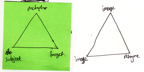
contiguity_triangles I'm interested in the relationships between objects. For the purposes of this piece of writing, 'objects' will be 2D images or titles/words.

I am interested in the relationships which can be formed between two objects when they are presented side by side- as in a book spread. The spread creates a context for the objects to inhabit and invites the viewer to understand not only two separate images, but also the narrative which the objects create together, through merit of sharing the same space.

There are three ways in which adjacent objects may reference each other.

The first is to do with the physicality of the objects - colour, shape, form -  strictly aesthetics. Two images may refer to each through merit of both being blue, or the focal point being a clock etc.

The second is concerned with the symbolical nature of an object and the ideas, attributes, and meanings which such objects reference. For example an image of a beach representing a memory of a holiday, a shell as a souvenir of the same experience, or a train ticket of the journey completed to get to the holiday. Other examples of ideological referencing could be religious symbols, celebrity icons, or brand logos.

The third referencing type is one of labelling and frames. Objects, even if attached arbitrarily, through their nature of sharing a page, refer to each other and have a dialogue. Through merit of being under the same title or being grouped together, these artefacts are forced to begin a discourse with each other. This is known as contiguity- from Aristotle’s ‘Laws of Association’- whereby things which are in close proximity are linked and ‘readily associated’.

Referencing is what allows objects to connect with each other and have a dialogue. Whether this dialogue is interesting or communicates the intentions of the curator depends on how well those objects rhyme together.

The skill of rhyming objects is similar to that of the story teller: to create either an ideological or physical (material or aesthetic) thread between a group of objects to create a fuller, deeper understanding of their context, history, and narrative. Juxtaposition of objects is very important and a pair may still rhyme even if the neighbouring objects are incomplete. Rhyme can give a spread a certain poetic and approximate logic.

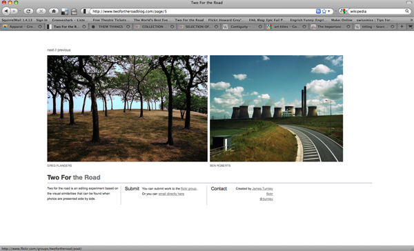
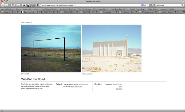
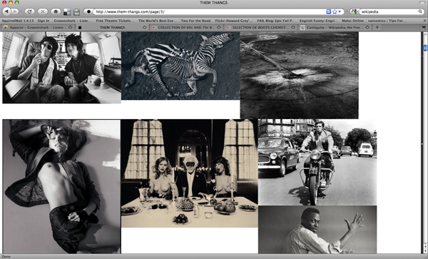
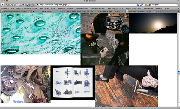
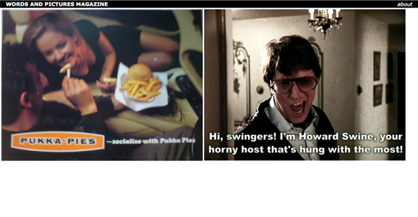
I am particularly interested in the accidental ways in which objects may rhyme- when two things are abstracted from their original context and framed as a pair to extract something entirely unexpected and meaningful. contiguity_twofortheroad_01contiguity_twofortheroad_02 James Turnley created 'Two for the Road' as "an editing experiment based on the visual similarities that can be found when photos are presented side by side." Through merit of proximity the images share a contiguous dialogue. Through this, the image's messages are skewed and a new message emerges. In a similar way that the title of an artwork affects the context it is viewed in, so when objects are put together they cannot help but be changed by each other. contiguity_themthangs_02contiguity_themthangs_01 'Two for the Road' is a curated attempt to create rhyme. 'Them Thangs' is run by Justin Blyth: 'It is a collection of things I like, intended for visual inspiration'. It is perhaps best described as a visual blogzine. The display of the images is part curated and part organic. Images are selected but then allowed to flow through the page, creating many and different relationships. Images which ordinarily would seem unremarkable, when viewed as a collection (through benefit of being physically/aesthetically, ideologically or contiguously related) become a necessary part of a captivating and beautiful whole. contiguity_wapm_01contiguity_wapm_02contiguity_wapm_03 Words and Pictures is a website I am in the process of creating with Mike which attempts to cultivate the moment of rhyme by allowing uploaded content to appear next to each other randomly. This is to further explore the themes discussed here: particularly contiguity, and also to create content for an off line printed magazine of curated and edited pairs of objects.

Mastercrafts: Green Wood Craft

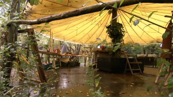
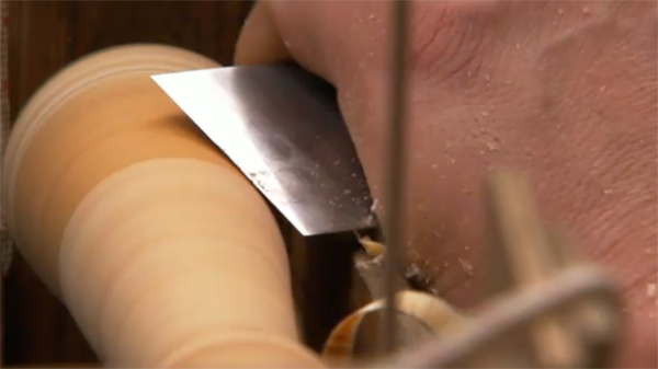
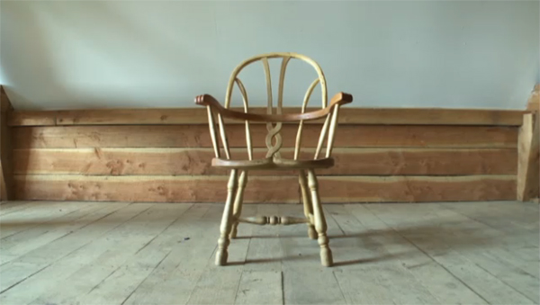
greencraft_01greencraft_03greencraft_02 Amazing and inspiring documentary about wood work- really makes you want to run away into a forest and do some bodging. They talk about how in the modern world we are too disconnected from all the material sourcing and making processes and that with creating your own tools and objects (from lathes to kitchen spatulas to decorative chairs) comes a real freedom. The stuff they make is ridiculously strong and durable and when one guy talks about how he's spent 60 hours crafting a chair you get a real idea of the value imbued in that object.

Taking this topic somewhere else: I feel that if more of the stuff and objects we owned were either made by us- or had some kind of time and value invested into them by us, then that would be good thing. Possessions with a narrative attached to them- 'I found this thing here' or 'I restored this' or 'I made this'- seem to be more special and used with a greater joy than some white goods cracked out from China or something. (I think most people have a few things like this- for myself it's the chair that I found in the street, the table I made, the bike my brother restored for me, and the cafetiere that I discovered down Deptford Market.)

I'd like to figure out ways of getting some of the essence of the show mentioned into my life in London. Suggestions very much welcomed.

Interactive vs. Reactive

I wrote this blog over on the Moving Brands website (under the pen name Rex McWhirter):

PAPPELTALKS from vizage on Vimeo.

Found this via the fantastic today and tomorrow blog. This CD cover designed by Hubero Kororo, leaks ink upon opening, thus creating a unique artwork where the user completes the design. T&T described the project as ‘interactive’ and I suppose to a degree it is. The fact that the trigger, and process, by which it creates surprise and mystery, is  characteristic of a lot of interaction design. But I think it’s more reactive, the process can only be controlled a little and it’s a one time only event. There is something very beautiful about it and I find something really refreshing in the analogue, physical way it works.