 Having just completed a placement at Kin Design and currently hanging about with the nice people at Moving Brands a few really interesting things have passed my way- here is an assortment of my favourite bits and pieces from the AR world.
This is Sticky Light, not sure if it is strictly Augmented Reality but it's super cool so fuck it.
This is an amazing ted talk which I can't quite believe I hadn't seen before- the set up means that data can be projected onto almost any flat surface (a wall, your hand) and interacted with using coloured fingertips and a camera- all for only $200.
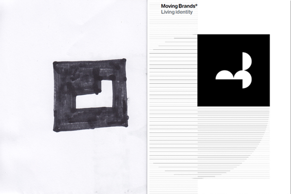
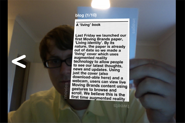
Moving Brands recently released their Moving Identity Paper. The front cover has their logo on it- a programme can recognise this and augment things on top- the real kicker though is that built into the programme is an interface- held straight on there are blog posts, rotate 90 degrees it's images, again and it's tweets, another 90 and it's videos. You can also scroll through previous and next content by moving the book left and right, if you tilt the book it scrolls down longer blogs- seriously incredible and a brilliant example of the principles which are in the book.
You can use the book to interact with the application which is on their website over here. Or print the glyph off yourself or even, and I think this creates even more potential for this technology, you can draw it yourself. The image above shows the actual cover and my crude, blocky drawing that I used to interact with the programme.


 This flyer for Field Day held in Victoria Park- simple and really striking.
 and this really nice magazine from Queen Mary's in Mile End. Uses some very nice clean type over image (which i'm also preparing a post on at some point) It is pretty nicely done all over but the cover is a real beaut if you ask me. It's also worth pointing out that all of these examples are printed on uncoated stock with no varnish or owt.


