I agree with everything Liam's said, Interventiontastic
Service Envy
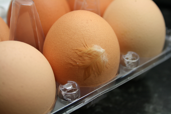
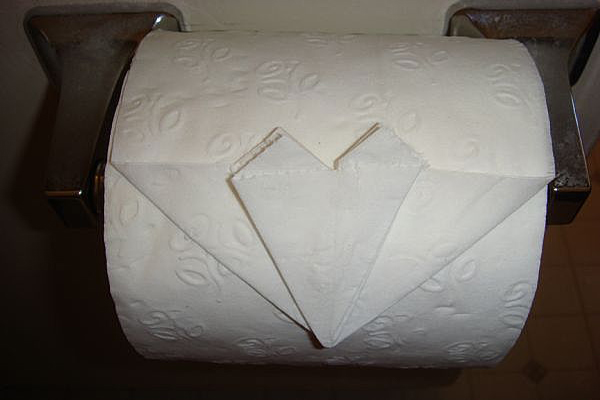
Got this little surprise in my eggs today- my girlfriend cringes but it reassures me, chickens have actually been somewhere near my eggs, I quite like the idea that they might put the feather in to convince the consumer that it was free range. Conversely Jo likes the folded corners on toilet paper- it reassures her that someone has been and cleaned, it creeps me out a little that someone might be watching me... Anyway both are nice examples of something which I believe is reffered to as 'service envy'- a phrase qoined by the people at live|work
Conceptual Jewelery


Advert Textured Club Wallpaper
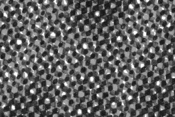
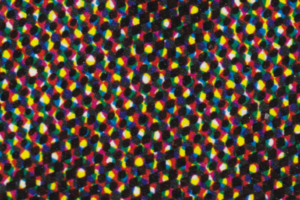
Hey so the other day when I was in a horrible club feeling kinda like I wanted to not be there at all I had an idea which could be sa-weet. When you get real close to a massive billboard they are all printed with these layers of dots- obv, but they make up this weird pattern which looks kind of like circles- if you squint you can see them in the image below- my idea is for a wallpaper that looks like these dots/texture/pattern, larger than on the advert of course and in grayscale (perhaps lighter than shown here) for a club so in the day time- it could not look and feel like a fucking shit hole, and be a bar or function room or whatever, and then night time decends and the ravers come out and the crazy lights hit it up and trip that shit out. uns uns uns.
Today and Tomorrow
I cannot rate this blog highly enough- stick it in your rss feed or something but be sure to check out the stuff in the archives. Link is over here.
No. Really? Internet image compositing
Augmented Reality
 Having just completed a placement at Kin Design and currently hanging about with the nice people at Moving Brands a few really interesting things have passed my way- here is an assortment of my favourite bits and pieces from the AR world.
This is Sticky Light, not sure if it is strictly Augmented Reality but it's super cool so fuck it.
This is an amazing ted talk which I can't quite believe I hadn't seen before- the set up means that data can be projected onto almost any flat surface (a wall, your hand) and interacted with using coloured fingertips and a camera- all for only $200.
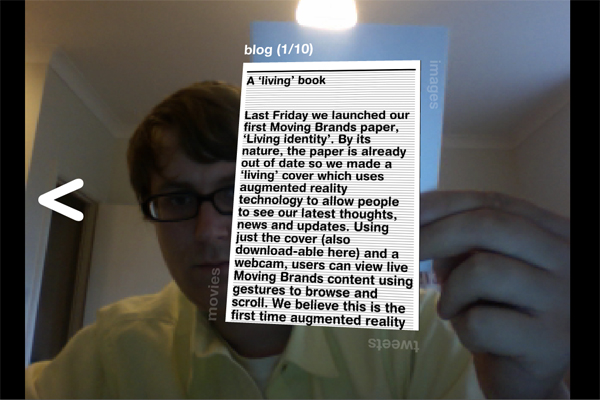
Moving Brands recently released their Moving Identity Paper. The front cover has their logo on it- a programme can recognise this and augment things on top- the real kicker though is that built into the programme is an interface- held straight on there are blog posts, rotate 90 degrees it's images, again and it's tweets, another 90 and it's videos. You can also scroll through previous and next content by moving the book left and right, if you tilt the book it scrolls down longer blogs- seriously incredible and a brilliant example of the principles which are in the book.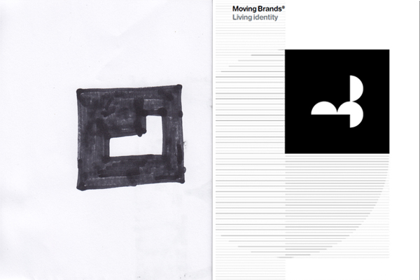
You can use the book to interact with the application which is on their website over here. Or print the glyph off yourself or even, and I think this creates even more potential for this technology, you can draw it yourself. The image above shows the actual cover and my crude, blocky drawing that I used to interact with the programme.
Long Ol Type
I noticed something recently- maybe it's been around maybe it's always been around but more type these days has been brought to my attention that is kind long. Example:

This excellent show catalogue/teaser/book/I'm not sure from Lincoln School of Art and Design Graphic Designers- (website's not the same really but hunt down the designers and check out their sites too- good stuff)- seriously ace work in here- it's less like a catalogue more a picture essay about anticipation- come round to my house and I'll show you. Really very good.
 This flyer for Field Day held in Victoria Park- simple and really striking.
 and this really nice magazine from Queen Mary's in Mile End. Uses some very nice clean type over image (which i'm also preparing a post on at some point) It is pretty nicely done all over but the cover is a real beaut if you ask me. It's also worth pointing out that all of these examples are printed on uncoated stock with no varnish or owt.
I guess 'long' type isn't a very good description I suppose condensed or something better describes it- but it seems to be about a lot and I really like it, quite understate, simple and often letting the context or other content help it out. There's this really tasty font just released from Hoefler & Frere-Jones, it's called Tungsten:
