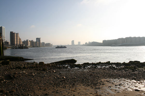
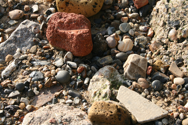
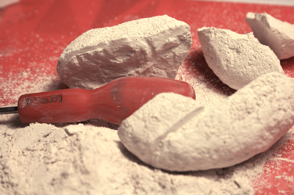
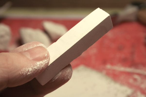
Picked up some chalk from a beach in Limehouse. I carved it into some special London chalk. What should I do with it now do you think?
Dispatchworks
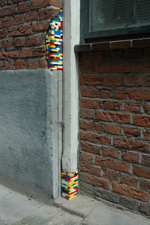
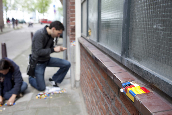
Beautiful repairs/artworks in an ongoing project by (as far I can tell) Jan Vormann & friends around Tel Aviv, Berlin, Amsterdam, and Bochignano in Italy . He's part of Platform 21 which seems like an interesting group of people also. I love these images for their striking anachronistic colour and geometry. As big Kev McCloud always points out- restoration is a mix of faithful material and technique vs. the super modern and as long as you make the new stand out, you're alright.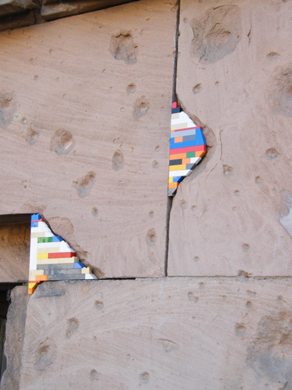
The Lonely Image
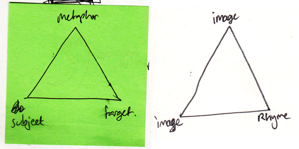 I'm interested in the relationships between objects. For the purposes of this piece of writing, 'objects' will be 2D images or titles/words.
I am interested in the relationships which can be formed between two objects when they are presented side by side- as in a book spread. The spread creates a context for the objects to inhabit and invites the viewer to understand not only two separate images, but also the narrative which the objects create together, through merit of sharing the same space.
There are three ways in which adjacent objects may reference each other.
The first is to do with the physicality of the objects - colour, shape, form - strictly aesthetics. Two images may refer to each through merit of both being blue, or the focal point being a clock etc.
The second is concerned with the symbolical nature of an object and the ideas, attributes, and meanings which such objects reference. For example an image of a beach representing a memory of a holiday, a shell as a souvenir of the same experience, or a train ticket of the journey completed to get to the holiday. Other examples of ideological referencing could be religious symbols, celebrity icons, or brand logos.
The third referencing type is one of labelling and frames. Objects, even if attached arbitrarily, through their nature of sharing a page, refer to each other and have a dialogue. Through merit of being under the same title or being grouped together, these artefacts are forced to begin a discourse with each other. This is known as contiguity- from Aristotle’s ‘Laws of Association’- whereby things which are in close proximity are linked and ‘readily associated’.
Referencing is what allows objects to connect with each other and have a dialogue. Whether this dialogue is interesting or communicates the intentions of the curator depends on how well those objects rhyme together.
The skill of rhyming objects is similar to that of the story teller: to create either an ideological or physical (material or aesthetic) thread between a group of objects to create a fuller, deeper understanding of their context, history, and narrative. Juxtaposition of objects is very important and a pair may still rhyme even if the neighbouring objects are incomplete. Rhyme can give a spread a certain poetic and approximate logic.
I am particularly interested in the accidental ways in which objects may rhyme- when two things are abstracted from their original context and framed as a pair to extract something entirely unexpected and meaningful.
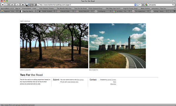
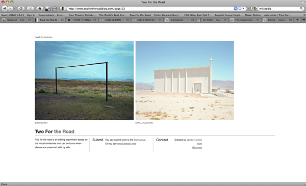 James Turnley created 'Two for the Road' as "an editing experiment based on the visual similarities that can be found when photos are presented side by side." Through merit of proximity the images share a contiguous dialogue. Through this, the image's messages are skewed and a new message emerges. In a similar way that the title of an artwork affects the context it is viewed in, so when objects are put together they cannot help but be changed by each other.
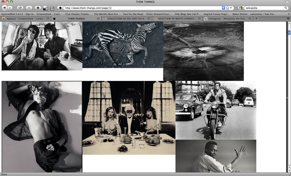
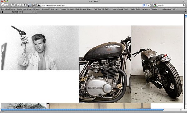
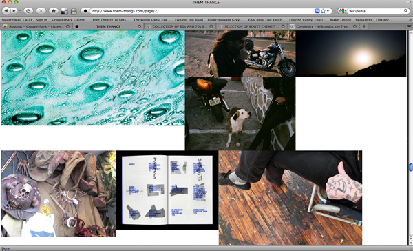 'Two for the Road' is a curated attempt to create rhyme. 'Them Thangs' is run by Justin Blyth: 'It is a collection of things I like, intended for visual inspiration'. It is perhaps best described as a visual blogzine. The display of the images is part curated and part organic. Images are selected but then allowed to flow through the page, creating many and different relationships. Images which ordinarily would seem unremarkable, when viewed as a collection (through benefit of being physically/aesthetically, ideologically or contiguously related) become a necessary part of a captivating and beautiful whole.
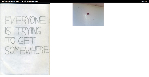
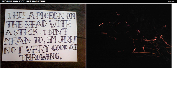
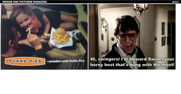 Words and Pictures is a website I am in the process of creating with Mike which attempts to cultivate the moment of rhyme by allowing uploaded content to appear next to each other randomly. This is to further explore the themes discussed here: particularly contiguity, and also to create content for an off line printed magazine of curated and edited pairs of objects.
Some notes on manufacturing and it's implications
So an amalgamation of things has led to this post- I'm pretty much going to repost stuff that I've collected on my way through the web. This is a google image of Google HQ in California.
First up is a great documentary off of the BBC- The Virtual Revolution: The cost of free. Here's a couple of interesting parts of the film in quote form:
Douglas Rushkoff (Author: Life Inc)
Dr Aleks Krotoski (The shows presenter)
-----
Next is a repost from Ben Terrett of Noisy Decent Graphics blog (also of the RIG) about 'The silver TV steel and glass stand'...
This design kind of sums up everything I hate about bad design in the naughties.
1. It's totally meaningless, devoid of any added value. 2. It's essentially a style that's been ripped off. Hugely derivative of something (probably from Ive) that was once good and then expanded and bastardised to death. 3. It triggers more poor imitations, and leads design buyers to say things like "I want it like they did it". 4. Everyone blindly buys one because everyone else has bought one. No one actually stops to think, do I like this? 5. It's so damn ugly and intrusive. Sat in the corner of your lounge looking shit.
-----
Next is a repost from It's Nice That's 'Discussion' Feature: 'The Blog Blackout' by Chris Gray...
So, where now, how do we stay aware without falling into the pitfalls of styles and trends?
-----
So fill in the gaps yourself, and rant over. Go watch that documentary though- here.
Manufactured Landscapes
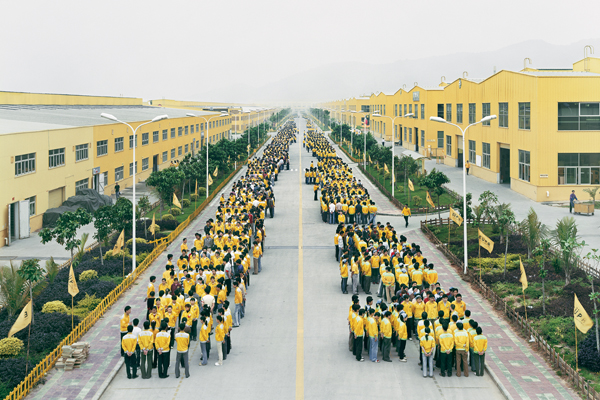
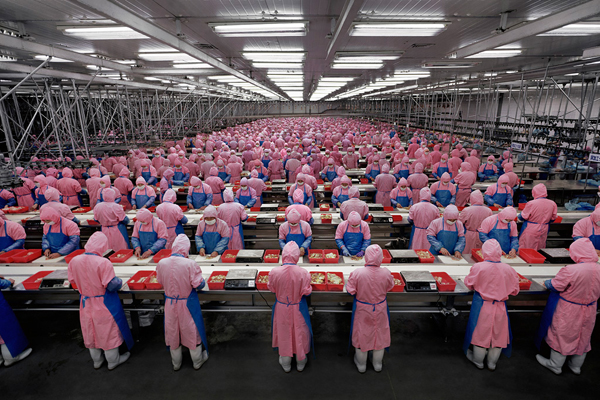
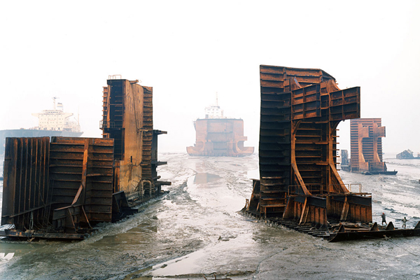 A nice follow on from the last post: this is a feature length documentary by Jennifer Baichwal about the photographer Edward Burtynsky. He takes stunning photographs of landscapes which have been drastically altered by human activity- think open mines, endless factrories and ship breaking beaches.
It's powerful and beautiful stuff but also very open ended. As Burtynsky himself points out- he doesn't take a 'this is bad' political stand point- but lets people see what they want to see. There's an obvious sustainability and 'aren't we fucking up the planet' message that can be read but also there's a whole look at human progress and our advancement in conquering nature or something.
Interesting film, more a piece of journalism than a pointed 'An Inconvenient Truth' thing but well worth watching.
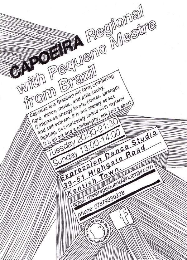
Capoeira Poster I done
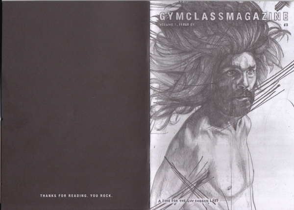
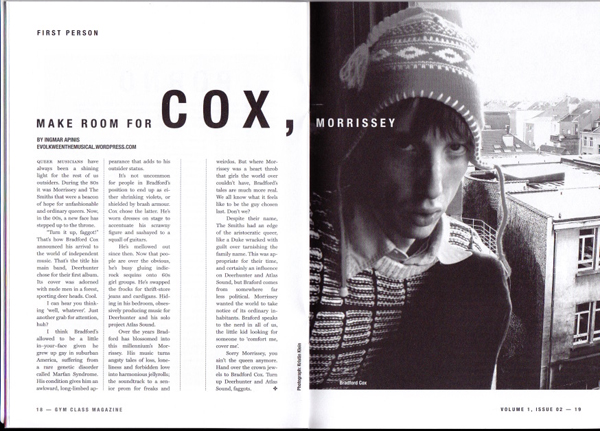
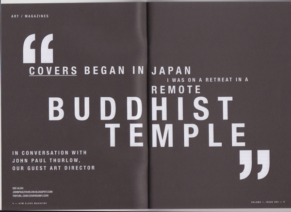
Gym Class Magazine
A nice magazine I spotted over at the Newspaper Club- I even got some nice little badges to boot-
