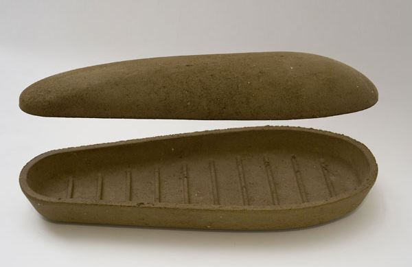
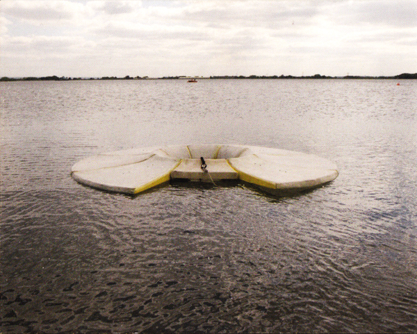
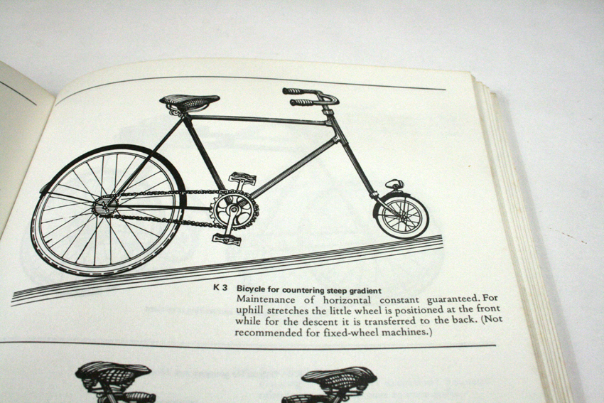
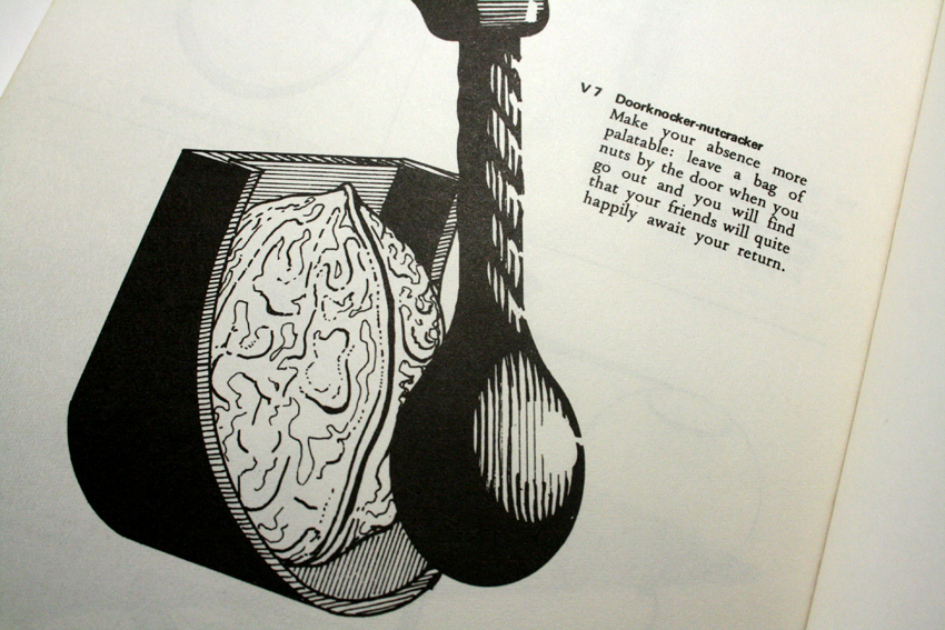
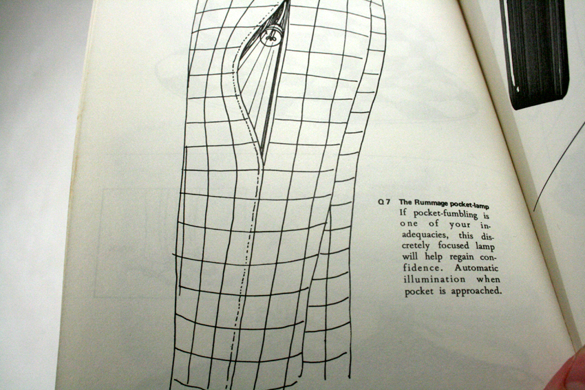
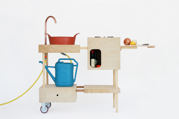
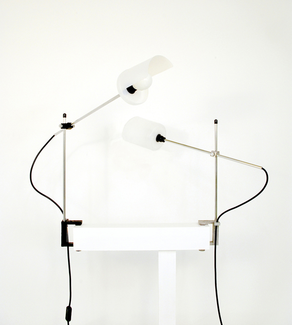
Came across this nice website/idea/collective. You can download DIY designs for all sorts of things but the main strain running through it is that you do it yourself and empower yourself through making and learning new processes. Shown here are my favourite two designs which, if I ever get a place with an outside, I'll be sorting out. The first is an outdoor kitchen by Nina Nolstrup. The second a lamp which, whilst not that exciting itself, in the making of it requires you to build a charcoal powered 'flower-pot furnace'. Designed by Chris Jackson. Awesome.
Emily Pilloton on TED
I think maybe the best you could ever hope to be able to say about any kind of design is 'yeah- something there is right'. Project H in this video has got something right. It's what design strives to be I think.
Offset
Came across a brilliant set of videos from Offset which is a 3 day creative conference. These videos are from 2009- expect the 2010 one shortly. But the line up is brilliant and it's a great resource- all are good but I am a massive fan of the Oliver Jeffers, David Shrigley, Chip Kidd, Harry Pearce and Anthony Burrill talks. All excellent. Offset link: here.
RCA Round up
Little bit late but here it is. Went to the RCA in short- was surprisingly disappointed with the Interactions work- I think now that most people can use an arduino a bit and appreciate that electronics and stuff isn't as hard as it used to be, the magic has left a bit. I'm not impressed now by a sensor or a projector with a something on it- I've seen it before- quite a bit. It all needs to be coupled with an intelligent and good idea which didn't seem as apparent as in previous years. I was surprisingly pleased with the Product stuff though- don't know why- perhaps because a fair bit of the interactions electronicy stuff has osmosised over- as I said- all that stuff is a lot more accessible than it used to be- the best piece of electronic interaction that was there was in the Design Products space. Whispering Leaves by Ji Long Shon. (and is that Charlotte on her website?)
Earth Coffin by George Fereday looks like what it is- but a good idea mind.
Pressed Chair by Harry Thaler. Not often I like chairs- but this one seems to actually live up to it's eco concepts- I like that if you left it outside it might begin to look like a watering can. I think the raw metal one would look better with age- tricky to do.
Disappearing by Andrew Friend. Read the website and see the pictures. I like this one for a few reasons- the objects look like they are older than they are- the one for the sea looks like a 20 year old buoy. Also the project only comes alive in the photographs- the objects are almost by the by- the photos are the heroes here- contextualising the objects in wall sized photographs at the show was a winner- I've got a real thing at the moment for how far do you need to take a project before it's a project.
This Happened
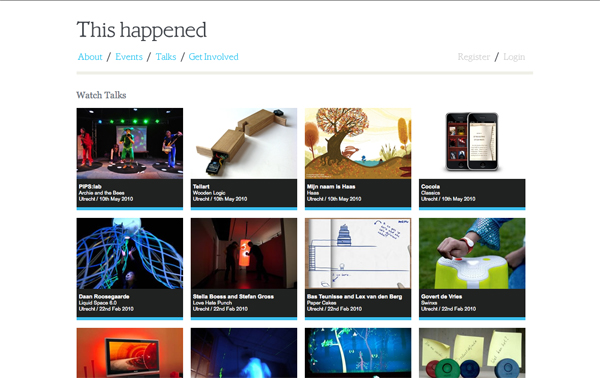
I only 'This Happened' found this one the other day- not sure how I missed it for so long to be honest- Created/curated by Chris O'Shea, Joel Gethin Lewis and Andreas Müller, it's basically videos where a designer (normally interaction) talks through one of their projects for a bit and then takes questions. There's a couple of gems in there- I'm a big fan of Matt Cottam of Tellart's talk about wooden logic.
Dieter Rams
Wasn't sure I was going to enjoy the exhibition to be honest- I mean I know a bit about the guy and the designs but couldn't help feeling they were slavishly following a movement rather than doing there own thing and that they were plastic monstrosities created to be consumed and re bought with a different shell. The objects were however filled with an integrity and honesty which rendered a good majority of the objects still very contemporary looking. Of course some things dated- portable record players and some of the shavers and coffee makers. But alot of the audio equipment could have come straight out of Muji- and on reflection alot of the clean functionality which is characteristic of Ram's work for Braun can still be seen in Industrial Facilities work for Muji and others- (and if were going to name drop other contemporay people designing like that there's Apple to consider). I re-found Rams' 'Ten Principles of Good Design' and when you see some of the pieces it resounds very well. His universal shelving system is still on sale today and it really is a testament to the design that it looks so fresh.
1) Good design is innovative.
2) Good design makes a product useful.
3) Good design is aesthetic.
4) Good design makes a product understandable.
5) Good design is unobtrusive.
6) Good design is honest.
7) Good design is long lasting.
8) Good design is consistent throughout.
9) Good design is sustainable.
10) Good design is as little design as possible.
Dispatchworks
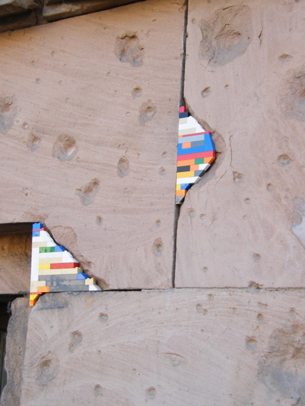
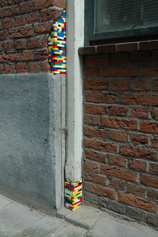
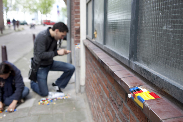
Beautiful repairs/artworks in an ongoing project by (as far I can tell) Jan Vormann & friends around Tel Aviv, Berlin, Amsterdam, and Bochignano in Italy . He's part of Platform 21 which seems like an interesting group of people also. I love these images for their striking anachronistic colour and geometry. As big Kev McCloud always points out- restoration is a mix of faithful material and technique vs. the super modern and as long as you make the new stand out, you're alright.