A couple of really nice clock designs- both web based and both are a bit sort of fuzzy and inaccurate. They give a feeling of time rather than accuracy- I like that. Click the pics to visit the sites. Helvetictoc by Tobie Langel. Blockclock by Futurefabric and Airside.

Links Clearout: Graphics
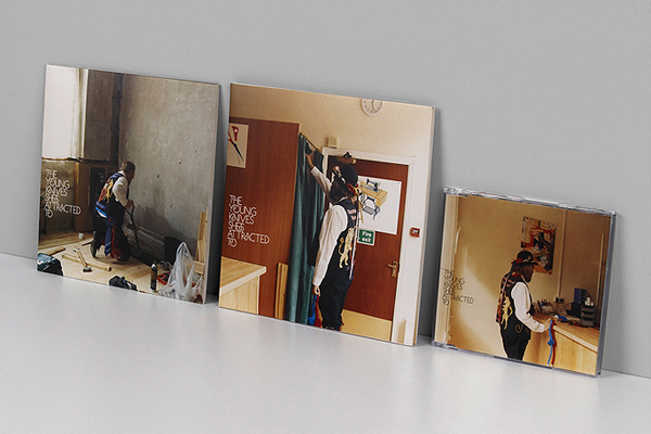
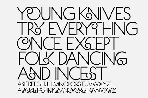
Been having a big links clearout. I don't normally post graphics, seems self indulgent but these two examples have been kicking around for a while and I keep coming back to them- really fantastic work. Tappin Gofton for The Young Knives', Of Animals and Men album:
Zip Design for Tom Jones', 24 Hours album:
Old Photo Gifs
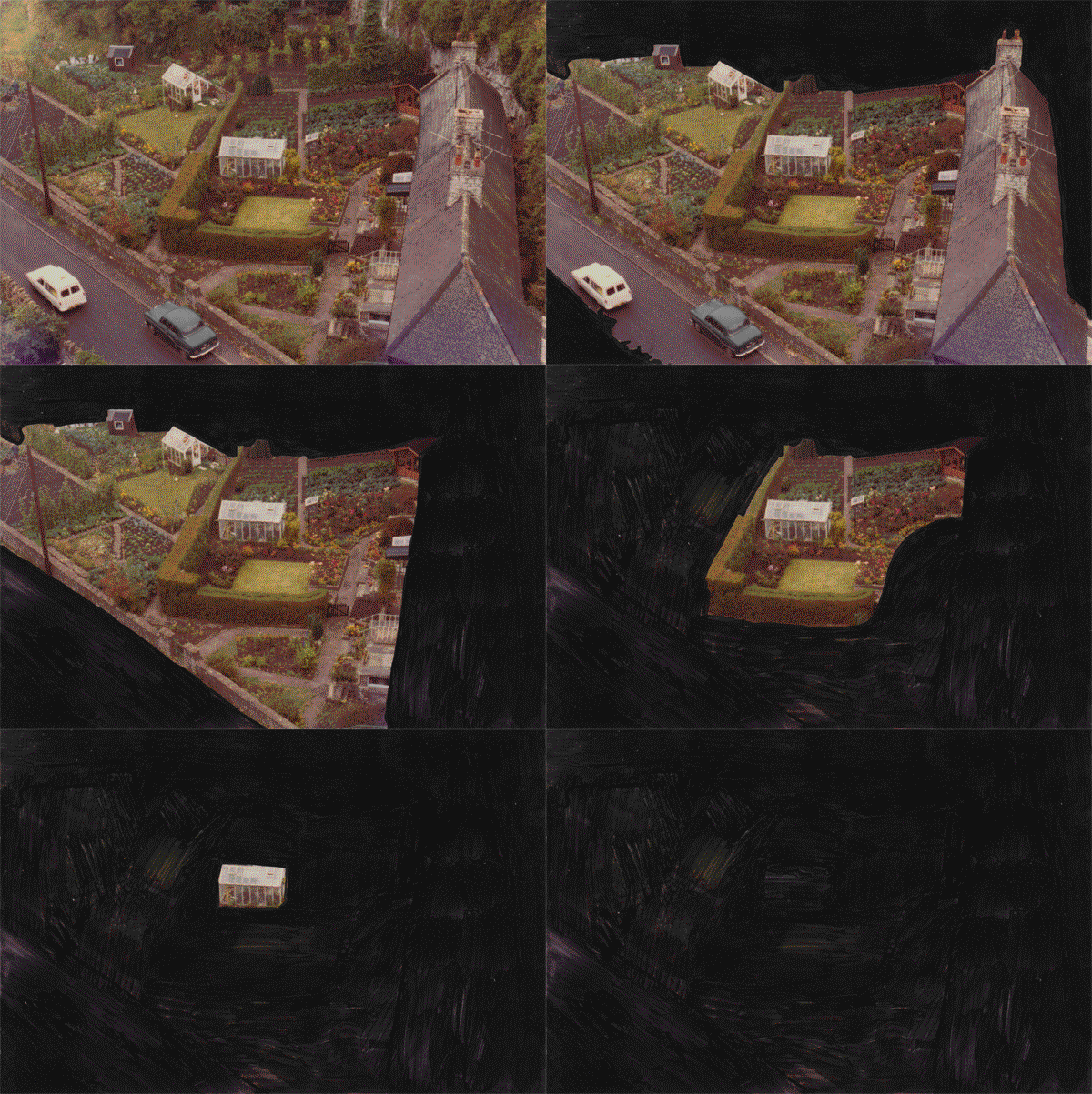
A few years back a load of stuff got left outside our house from a house clearance. I managed to rescue a Sydenham familie's photo albums from the 70s. Mostly the pictures are crap photographically but together there's a certain Britishness to them. After watching the Mariner's Children video 'It Carved Your Name Into The Ground' by Betsy Dadd, I thought I'd do this with all of them and eventually put them to music I suppose. For now here is a gif.
December 2010 Pics
Merry Christmas kids!
Andrew Hem
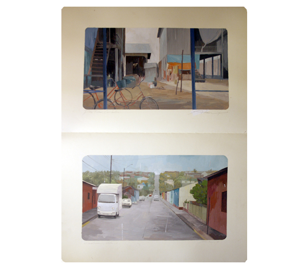
I went to the opening (and only!) night of a show my friend Tomomi Sayuda was involved with called Nixon Art Mosh. Only really one guys worked jumped out at me, this was the illustration work of Andrew Hem. He exhibited landscapes from moleskin sketchbooks. I particularly liked the way that the actual sketchbooks were framed rather than just the pages, and also the way the images where framed on the page was great. When you were looking at the work the fact that the sketchbook was there in front of you was very apparent and you got a real feeling of effort and worth form them- I was very aware a person had spent time making these images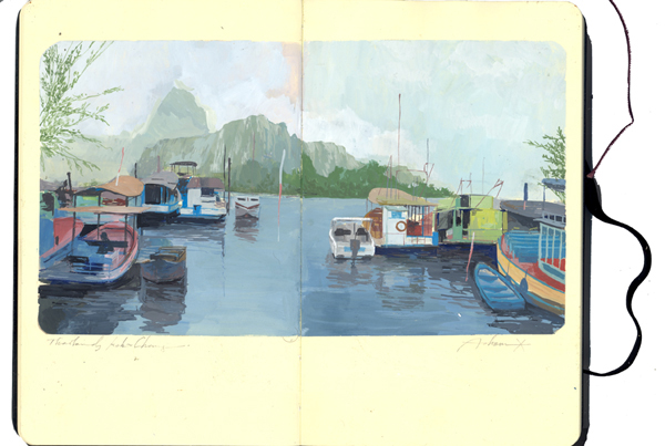
 .
.
Photos October 2010
Design Reseach Unit & Power in Consistency
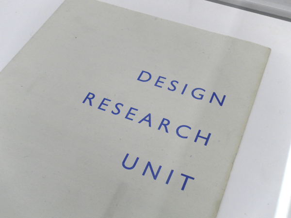
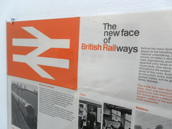
I went and saw the Design Research Unit (DRU) show over at Cubitt Gallery in Angel this weekend. I'd shamefully never heard of these guys but they were the original post/multi/trans disciplinary guys. Working over industrial, architectural, advertising and graphic design they were formed in 1943 (cheers Wikipedia). They have impeccably designed material which covers branding for the likes of ICI, Ilford and the legendary graphic system for British Railway. (Which always reminds me of Roundels equally legendary rebrand for Railfreight in the 80s). All of this belongs to a style of solid, accurate and robust design who's strength comes from not just the flawless work but also the consistency of it's application. The guidelines they lay down for the brands are exhaustive and particular and you get a real sense that the brands they created are successful through the rigour laid down by their creators. It is in contrast to the work of one of today's branding forces: Moving Brands. Their offer is based on their brands adapting to different situations and responding to it's audience. This is great for today's twittered up social networked scene but I don't know that it necessarily creates the same kind of well loved, iconic and long lasting work as the commanding and authoritarian brands from DRU. I suppose it has a lot to do with different times and approaches- DRU's work is not very sympathetic to the contexts it's applied to- it imposes itself but then as time passes it's audience grow up with it and it becomes more comfortable. With MB's work it is more immediate and welcoming but perhaps more transient- it will be interesting to see what from the brands created now will still survive and be as iconic 50 years on as British Rail. Perhaps the best name for a design practice ever:
The show is a traveling one and I loved the display which was on very functional and beautiful Dexion racking, mmm:

