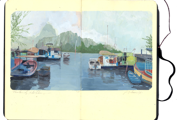
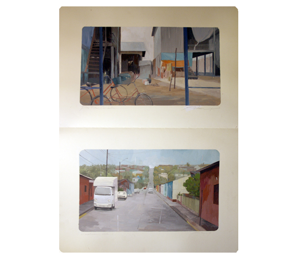
I went to the opening (and only!) night of a show my friend Tomomi Sayuda was involved with called Nixon Art Mosh. Only really one guys worked jumped out at me, this was the illustration work of Andrew Hem. He exhibited landscapes from moleskin sketchbooks. I particularly liked the way that the actual sketchbooks were framed rather than just the pages, and also the way the images where framed on the page was great. When you were looking at the work the fact that the sketchbook was there in front of you was very apparent and you got a real feeling of effort and worth form them- I was very aware a person had spent time making these images
 .
.
Videos
First up a lovely music video which my new studio chum Clara showed me, for The Mariners Children. The animation style is simple and genuine and kind of innocent, I really like it and can't put my finger on why- I think maybe it's the music video equivalent of a zine or something. Next up is a video showing the Tom Sachs studio rules. Beautifully done, funny and also some pretty solid rules. A nice insight into the workings of a great studio.
Sometimes making something leads to nothing
Saw this over at Pop-Up City. The guy basically pushes an ice block around Mexico City. I love the derivey, situationisty, psychogeographicy thing going on. Original article here: link
Offset
Came across a brilliant set of videos from Offset which is a 3 day creative conference. These videos are from 2009- expect the 2010 one shortly. But the line up is brilliant and it's a great resource- all are good but I am a massive fan of the Oliver Jeffers, David Shrigley, Chip Kidd, Harry Pearce and Anthony Burrill talks. All excellent. Offset link: here.