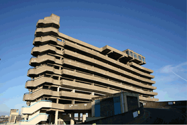
I recently read this great article over on Design Assembly about brutalist/70's/modernist/ugly architecture. It seems very hit and miss to me as to whether this type of building works- as the article says the Southbank Centre and Hayward etc. was criticised to fuck but now with a revamp- it's one of my favourite buildings in London. And again Trellick Tower round the corner from Portabello Road Markets is stunning to look at but I'm not sure I'd want to live there- not so however with the Barbican buildings- I love them, it feels like a hidden architectural paradise in the middle of the city; it's so quite especially if you go to the sort of little green house part- they have fish and tropical plants and it's a great place to eat your lunch. Read the article, see the pictures.

Sustainable stuff
I aint no hippy and i get bored by mindless scaremongering and recycle your shit bullshit. But this guy gave a really good talk- give it a bit though- the second half is the best.
Flickr: pictures and words
 I saw this picture while on flickr, and again, was going to rush over it and then I glanced the comment and suddenly was captivated. This is w&p for me, the sense making of two unrelated things which alone mean not much but together contextualise and compliment each other. The pair make for a quite a rich story.
MB Blog
So I did a little blog over on the Moving Brands site- it was about generative design a bit. Go over and check it out. Click the pic and move yoself.
 In the original post there was a bit about this great set of book jackets created in response to the D&AD brief set by Faber & Faber to create new designs for their print-on-demand film scripts series. Really pretty aesthetic to these guys, by Michael Kosmicki, as his site says "Inspired by the phenomena of a visual glitch, the design utilizes a logarithm that translates the title and section into a distinct graphic pattern."
I Wear My Sunglasses At Night
 A little story: I was on an image search for something unrelated to the picture above but this photo caught my eye, I was going to go past the thumbnail without any more thought but then I noticed the title i_wear_my_sunglasses_at_night_by_whitewhitewine.jpg. I clicked. I did because the title and the connotations of the song it referred to helped validate and perhaps make more sense of the image the title had been reappropriated for. I think this is pretty interesting and I know it's probably one of the big debates in art about titles, but I'm still enjoying the novelty of it right now. As Mike said, "I think it's called anchorage", The image was anchored by the song and all that I associated with it to create a much richer overall 'experience' of the photo. Hella Words & Pictures.
Service Envy
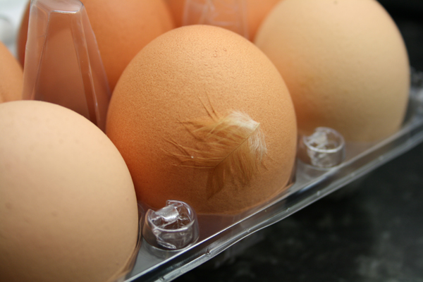
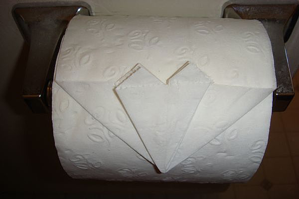
Got this little surprise in my eggs today- my girlfriend cringes but it reassures me, chickens have actually been somewhere near my eggs, I quite like the idea that they might put the feather in to convince the consumer that it was free range. Conversely Jo likes the folded corners on toilet paper- it reassures her that someone has been and cleaned, it creeps me out a little that someone might be watching me... Anyway both are nice examples of something which I believe is reffered to as 'service envy'- a phrase qoined by the people at live|work


