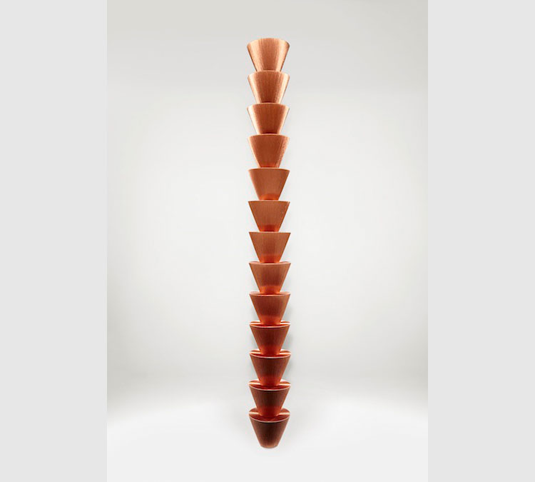
Things wrapped in copper thread. It’s a deceptively simple artistic process but the result is stunning. Helped along by the fantastic lighting design the ideas of concealment, repetition, abstraction, scale, and familiarity changed as you walked through the space and the pieces caught the light differently – interactivity at it’s simplest and effective. The images here show the range of scales the work takes, ‘Geometries 64 Shapes’, a collection of small objects on a wall, and ‘Ropes’, a 250m long installation that you could get inside and walk around.
I really liked how the thread brought the objects back to a collection of simple shapes, with what looked like dull planes and then as you moved they shimmered with texture. The original objects were physically there but, like a palimpsest, were ghosted and built on top of when given their copper lustre. My favourite piece wasn’t on a postcard: ‘Jars’ from Anderson’s site is below. Wellcome Collection link here.


