I recently read The Delirious Museum by architect and exhibition designer Calum Storrie. Here's some of my favourite bits. ----
Introduction pg 3: Robert Venuri:
"I am for messy vitality over obvious unity. I include the non-sequitur and proclaim the duality. I am for richness of meaning rather than clarity of meaning; for the implicit function as well as the explicit function. I prefer 'both-and' to 'either-or', black and white, and sometimes gray, to black or white."
----
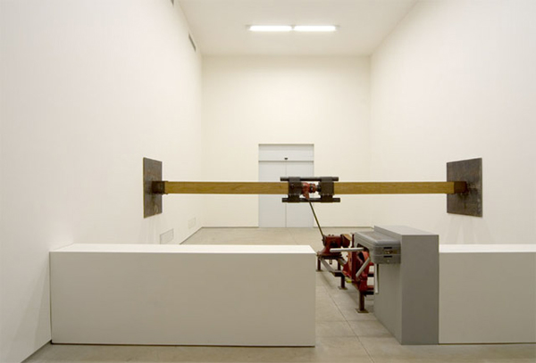
pg 67: Samson by Chris Burden is a piece of art that pushes apart the gallery it's in as visitors enter through a turnstile.
----
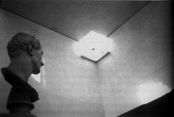
pg 138: This is Gipsoteca Canoviana in Possagno, Italy. A building designed by Carlo Scarpa which houses the working plaster models for sculptures. The space is a very simple cube but has the corners removed and skylights/windows (Scarpa described them as 'fragments of sky') installed instead. I really like this deconstruction/dismantling of the gallery space.
----
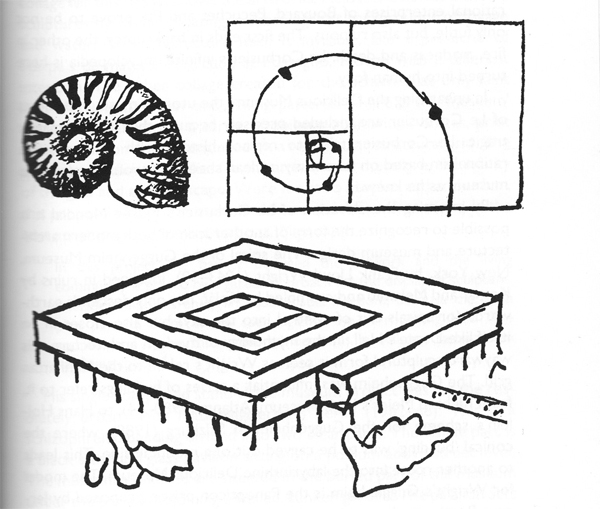
pg 151: The Museum of Unlimited Growth was designed by Le Corbusier in 1939. It attempts to solve the problem of a museum building which has an expanding collection (as most museums do). Visitors are directed through a channel in one side and arrive in the centre of the spiral structure from where they can explore the galleries and rooms. The museum can be expanding by adding more spiral over time. I love the idea of a never ending museum- a continuing process. Or even better one which is both complete (it is a complete building) and in process at the same time (it can be added to when needed).
----
