The Museum of Everything:
Another fantastic show, this time the Museum was out of it's Primrose Hill space and had taken up residence in Selfridges (I imagine a fairly contentious choice- but come on, to try and separate art and commerce is just naive and anyway I think these guys genuinely bring something great to the world and the more people that see it the better.)
The show was again outsider art and the obsession and otherness of the work was brought into the space by a series of small, packed rooms similar to previous exhibitions. This was really effective at giving a sense of discovery and strangeness, especially when you consider you were in Selfridges. I wish the book was more similar to the exhibition and less of an art book, although I understand why the work in the book is placed on white spreads and is quite 'proper' looking. However there is the digital version of the show for guys like me who enjoy the slightly more chaotic form of the exhibition: http://www.digevery.com/room1.html


Wellcome Collection- A Charmed Life
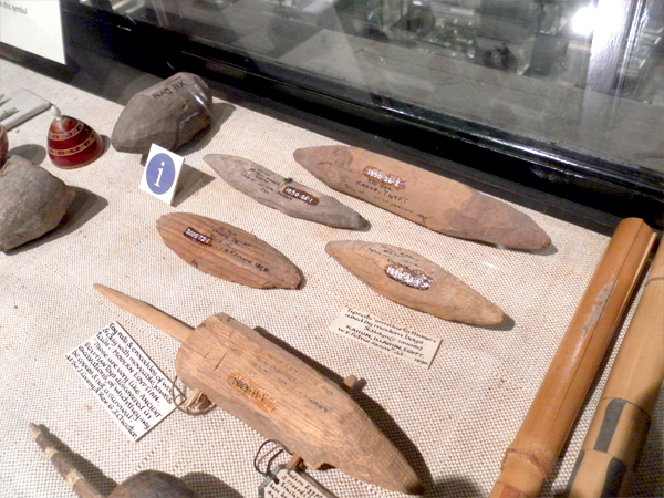
The standout bit for me in this exhibition was the layout of the charms in the center of the room. I also liked how visible the methods of collection were, (see photo below) where there were gaps from other objects collected at the same time which were now lost- being able to understand a little bit more about an objects story post-use or post-context, once it had entered the world of the 'collected object'.


Pitt Rivers:
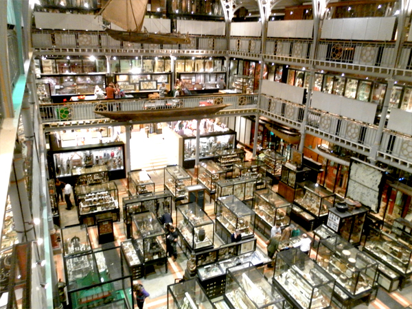
Wonderful as ever.


Ashmolean Museum:
A very well designed space and a nice place to have a walk around. I'm not mad into archeology but there were some great moments throughout the museum. The older part of the museum with the paintings in was entirely different in feel, more chambers and carpet and warmth than the informative, new, open space where you enter.
I really liked this quote in the exhibition about how the museum came to exist, (John Tradescant the elder to John Tradescant the younger to Elias Ashmole to The University of Oxford). On the cabinet of curiosity:
"I am almost persuaded a man might in one daye behold and collecte into one place more curiosities than hee should see if hee spent all his life in travell."


Design Museum: Terrence Conran
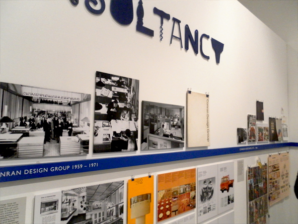
A superbly put together revelatory show which highlighted to me how much Conran has contributed and effected design in the UK.


Design Museum: Designers in Residence
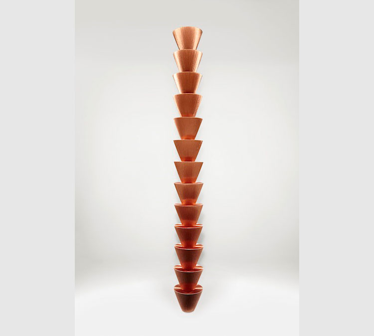
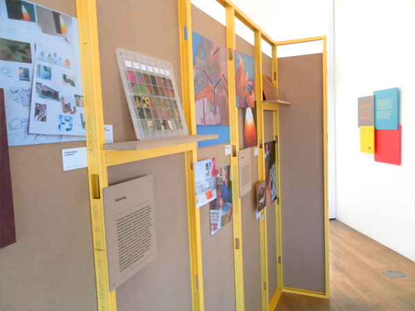
A really good exhibition design to this one. I particularly liked Will Shannon's reformed chipboard/concrete furniture.


British Museum:
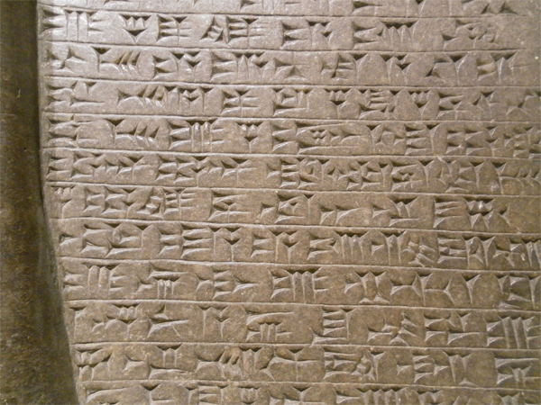
Classic museum going experience. Nice old stone.


