RCA Round up

Little bit late but here it is. Went to the RCA in short- was surprisingly disappointed with the Interactions work- I think now that most people can use an arduino a bit and appreciate that electronics and stuff isn't as hard as it used to be, the magic has left a bit. I'm not impressed now by a sensor or a projector with a something on it- I've seen it before- quite a bit. It all needs to be coupled with an intelligent and good idea which didn't seem as apparent as in previous years. I was surprisingly pleased with the Product stuff though- don't know why- perhaps because a fair bit of the interactions electronicy stuff has osmosised over- as I said- all that stuff is a lot more accessible than it used to be- the best piece of electronic interaction that was there was in the Design Products space. Whispering Leaves by Ji Long Shon. (and is that Charlotte on her website?)

Earth Coffin by George Fereday looks like what it is- but a good idea mind.

Pressed Chair by Harry Thaler. Not often I like chairs- but this one seems to actually live up to it's eco concepts- I like that if you left it outside it might begin to look like a watering can. I think the raw metal one would look better with age- tricky to do.

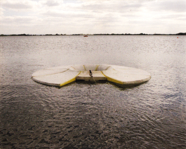
Disappearing by Andrew Friend. Read the website and see the pictures. I like this one for a few reasons- the objects look like they are older than they are- the one for the sea looks like a 20 year old buoy. Also the project only comes alive in the photographs- the objects are almost by the by- the photos are the heroes here- contextualising the objects in wall sized photographs at the show was a winner- I've got a real thing at the moment for how far do you need to take a project before it's a project.

Paula Antonelli

Paula Antonelli, senior curator at the MoMA has acquired the @ symbol for the permanent collection of the museum. That's pretty brilliant. I think what's more interesting is the kind of conversations she must have had with colleagues about it's inclusion- there was some opposition to it's acquisition. And what was discussed about what museums should and could acquire- what's the purpose of museums. And what effect does the acquisition have on the @ symbol in general- will people treat it with more reverence now it's been held on a pedestal? Interesting stuff. Click here to read Antonelli's blog about it over at MoMA.

Design Awards 2010

Took a trip to the Design Museum and here's my round up of favourites from the Design Awards. The stuff shown is what I reckon is most awesome- there was of course some stuff that I didn't dig- but the following was so good I left feeling good about the Design industry which I hadn't expected. This is Sugru- a material which can be moulded by hand and cures at room temperature to become a washable, heatproof silicone. Sold as coloured lumps in various sizes it's designed for hacking your objects- fixing, making better and is generally just awesome.

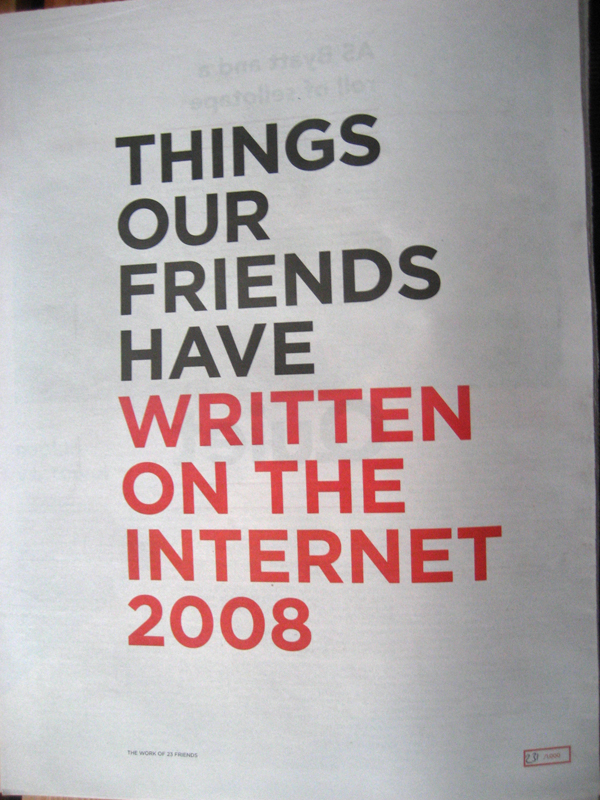
The Really Interesting Group (RIG) have created the Newspaper Club- utilising down time at printers they have created a service which allows individuals to upload artwork for their own newspapers of between 5 and 5000 copies- they've made printing incredibly affordable. Perhaps the most interesting (excuse the pun) thing which started it off  is 'Things Our Friends Have Written On The Internet', a publication aggregating images and text from blogs, and websites into a printed publication. Heavy web 3.0 shit.

dm_things_our_friends

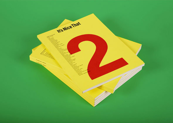
In a similar vain It's Nice That get my respect for producing a consistently quality package of blog, features, jobs board, exhibitions, artwork and most importantly for me an extremely affordable printed output: again, using the advantages of the internet to create content. Printing it turns it into something better- sort of brings it full circle.

dm_its_nice_that

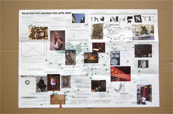
The Incidental has so many people involved that i'm not going to try and name check them all but it's pretty fucking encouraging to see some familiar names in there. Basically it's an almost immediate magazine based in and featuring both Milan 2009 and The London Design Festival 2009. Content was sourced from the people going around the events- tweeted, blogged, reported directly and then sifted, filtered and created into a new publication each day. Simple- brave- dramatically scaleable- pretty and above all useful.

dm_the_incidental

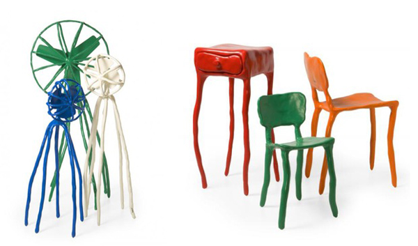
Real Time by Maarten Baas is a clock which is changed manually- he's done a few- some with brushes, some as installations but this one is done with some red glass- black paint (I think I read it was latex) and a squigee. Watch the video. Not in the show but found on his website: I really really like his clay furniture series- I mean I really like it and I'm not into chairs.

dm_maarten_baas Also worth a mention were BBC iPlayer, Amazon's Kindle (Both of these were of going to happen, but are still well designed and pretty revolutionary), Why Not Associates Literary Forest, and The Trillion Dollar Project (to raise awareness for The Zimbabwean newspaper.

The Lonely Image

contiguity_triangles I'm interested in the relationships between objects. For the purposes of this piece of writing, 'objects' will be 2D images or titles/words.

I am interested in the relationships which can be formed between two objects when they are presented side by side- as in a book spread. The spread creates a context for the objects to inhabit and invites the viewer to understand not only two separate images, but also the narrative which the objects create together, through merit of sharing the same space.

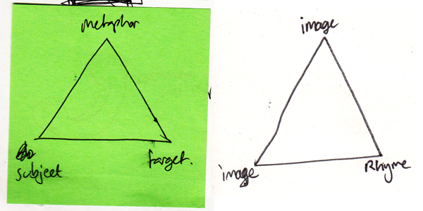
There are three ways in which adjacent objects may reference each other.

The first is to do with the physicality of the objects - colour, shape, form -  strictly aesthetics. Two images may refer to each through merit of both being blue, or the focal point being a clock etc.

The second is concerned with the symbolical nature of an object and the ideas, attributes, and meanings which such objects reference. For example an image of a beach representing a memory of a holiday, a shell as a souvenir of the same experience, or a train ticket of the journey completed to get to the holiday. Other examples of ideological referencing could be religious symbols, celebrity icons, or brand logos.

The third referencing type is one of labelling and frames. Objects, even if attached arbitrarily, through their nature of sharing a page, refer to each other and have a dialogue. Through merit of being under the same title or being grouped together, these artefacts are forced to begin a discourse with each other. This is known as contiguity- from Aristotle’s ‘Laws of Association’- whereby things which are in close proximity are linked and ‘readily associated’.

Referencing is what allows objects to connect with each other and have a dialogue. Whether this dialogue is interesting or communicates the intentions of the curator depends on how well those objects rhyme together.

The skill of rhyming objects is similar to that of the story teller: to create either an ideological or physical (material or aesthetic) thread between a group of objects to create a fuller, deeper understanding of their context, history, and narrative. Juxtaposition of objects is very important and a pair may still rhyme even if the neighbouring objects are incomplete. Rhyme can give a spread a certain poetic and approximate logic.

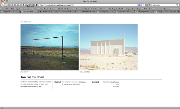
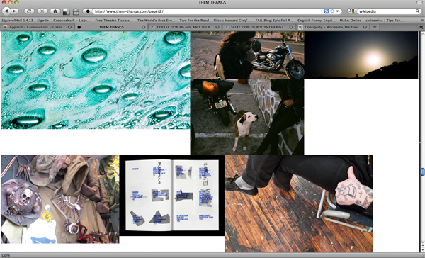
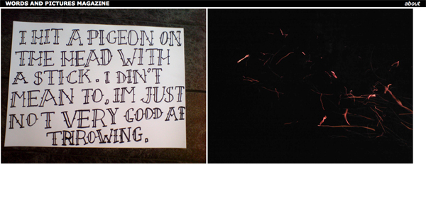
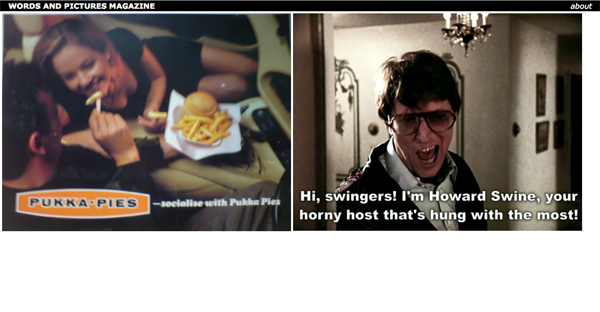
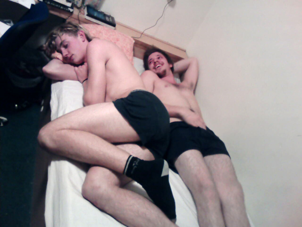
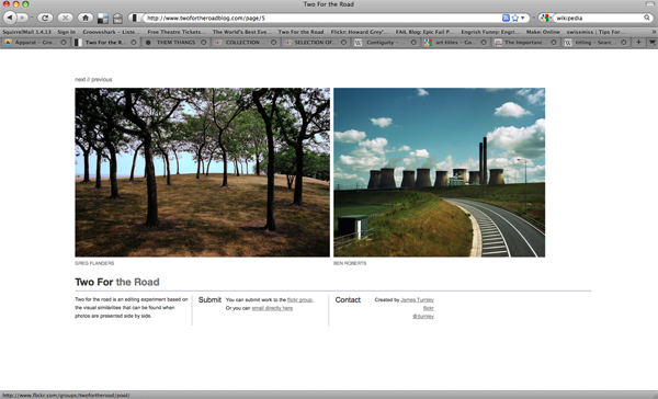
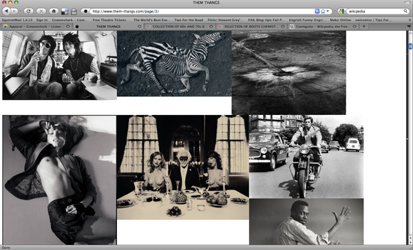
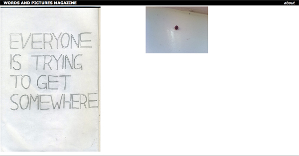
I am particularly interested in the accidental ways in which objects may rhyme- when two things are abstracted from their original context and framed as a pair to extract something entirely unexpected and meaningful. contiguity_twofortheroad_01contiguity_twofortheroad_02 James Turnley created 'Two for the Road' as "an editing experiment based on the visual similarities that can be found when photos are presented side by side." Through merit of proximity the images share a contiguous dialogue. Through this, the image's messages are skewed and a new message emerges. In a similar way that the title of an artwork affects the context it is viewed in, so when objects are put together they cannot help but be changed by each other. contiguity_themthangs_02contiguity_themthangs_01 'Two for the Road' is a curated attempt to create rhyme. 'Them Thangs' is run by Justin Blyth: 'It is a collection of things I like, intended for visual inspiration'. It is perhaps best described as a visual blogzine. The display of the images is part curated and part organic. Images are selected but then allowed to flow through the page, creating many and different relationships. Images which ordinarily would seem unremarkable, when viewed as a collection (through benefit of being physically/aesthetically, ideologically or contiguously related) become a necessary part of a captivating and beautiful whole. contiguity_wapm_01contiguity_wapm_02contiguity_wapm_03 Words and Pictures is a website I am in the process of creating with Mike which attempts to cultivate the moment of rhyme by allowing uploaded content to appear next to each other randomly. This is to further explore the themes discussed here: particularly contiguity, and also to create content for an off line printed magazine of curated and edited pairs of objects.
The Museum of Everything

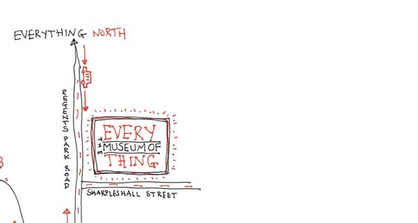
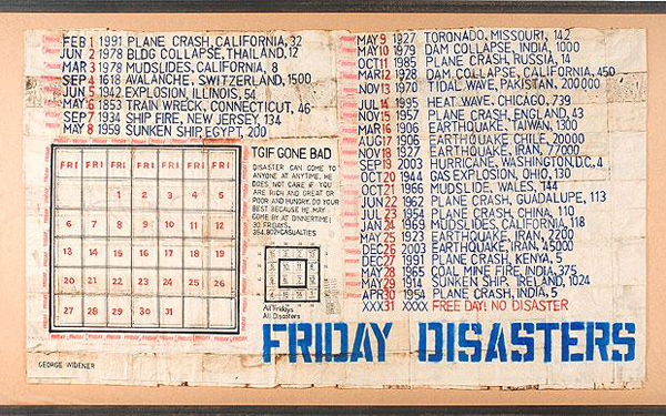
museum_of_everything_03Museum_of_everything_01museum_of_everything_02 Me and Lou went to The Museum of Everything the other day up near Primrose Hill (bloody jolly nice area as well you know), which was ace. It's a temporary gallery of sorts for 'Outsider Art', so basically lots of people who were or had been in psychiatric wards and mental asylums drawings, paintings and objets de art accompanied by introductions written by contemporary cultural/artistic types- Ed Ruscha, Jarvis Cocker, etc. As I imagine is the case with alot of outsider art, the context and lives of the artists where as interesting as the work itself. Also it's worth mentioning that alot of the works had a scale of spectacle about them- a dedication of immense amounts of time spent which adds to their effect- be it either immensely detailed drawings (they provided magnifying glasses) or the physical size of the pieces- one triptych was about like 6 or 7 metres tall,- or the number of similar pieces displayed, repetition seemed to play a fair part and coming from my collections point of view I reckon that the cumulative effect was very much a factor in the museum. (There was a nice moment where i heard a guy on the telephone saying 'I'm still at the Museum' which I thought was great, I think the distinction between a art gallery and a museum of curiosities is an important one- for some reason i feel closer to museums than galleries.) It didn't feel like a typical art space either- they museum guided you first up some steps and then through a series of small rooms and corridors- here was one of my favourite collections: Russian military enthusiast Aleksander Lobanov, Aleksander_pavlovitch

but the route then rounded a corner and you were standing at the top of some steps overlooking a massive double height space where the walls were dripping with paintings and drawings- the space was a warehouse like space too and the structure they'd erected to hang things on was brilliant- there were more rooms downstairs and at the end a place to get a cup of tea for a donation- brilliant. The graphics for the show were also spot on- the whole space thing was excellent and at the moment it's only on until the end of December so get down there.

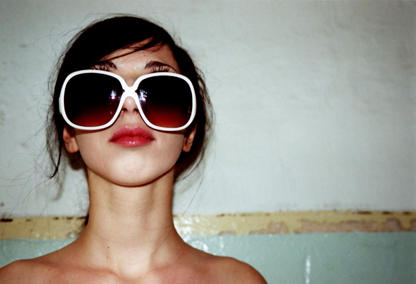
I Wear My Sunglasses At Night

i_wear_my_sunglasses_at_night_by_whitewhitewine A little story: I was on an image search for something unrelated to the picture above but this photo caught my eye, I was going to go past the thumbnail without any more thought but then I noticed the title i_wear_my_sunglasses_at_night_by_whitewhitewine.jpg. I clicked. I did because the title and the connotations of the song it referred to helped validate and perhaps make more sense of the image the title had been reappropriated for. I think this is pretty interesting and I know it's probably one of the big debates in art about titles, but I'm still enjoying the novelty of it right now. As Mike said, "I think it's called anchorage", The image was anchored by the song and all that I associated with it to create a much richer overall 'experience' of the photo. Hella Words & Pictures.