Autumn Exhibition Round-Up
The Museum of Everything: Another fantastic show, this time the Museum was out of it's Primrose Hill space and had taken up residence in Selfridges (I imagine a fairly contentious choice- but come on, to try and separate art and commerce is just naive and anyway I think these guys genuinely bring something great to the world and the more people that see it the better.)
The show was again outsider art and the obsession and otherness of the work was brought into the space by a series of small, packed rooms similar to previous exhibitions. This was really effective at giving a sense of discovery and strangeness, especially when you consider you were in Selfridges. I wish the book was more similar to the exhibition and less of an art book, although I understand why the work in the book is placed on white spreads and is quite 'proper' looking. However there is the digital version of the show for guys like me who enjoy the slightly more chaotic form of the exhibition: http://www.digevery.com/room1.html
Wellcome Collection- A Charmed Life
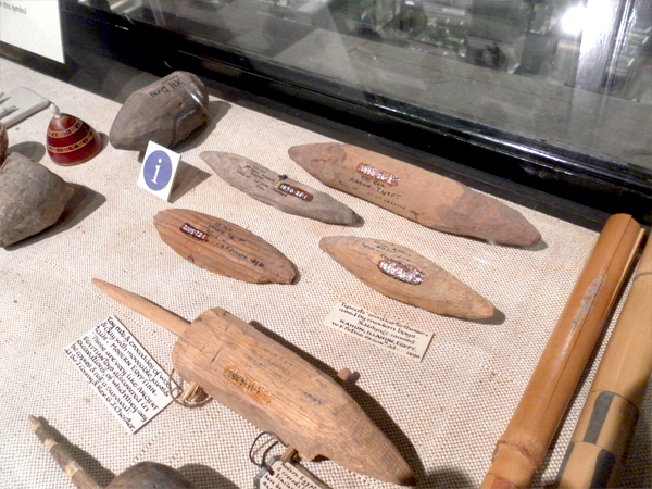
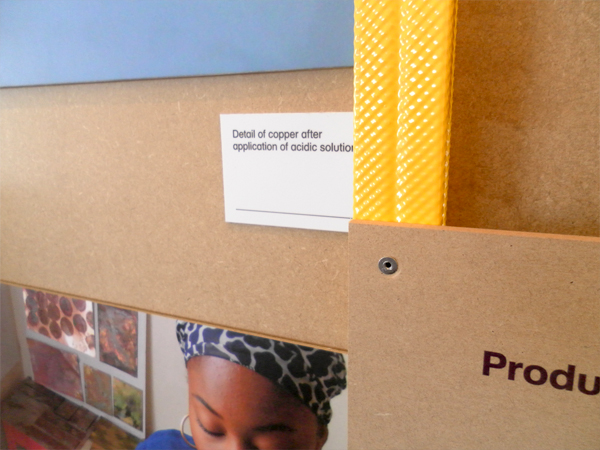
The standout bit for me in this exhibition was the layout of the charms in the center of the room. I also liked how visible the methods of collection were, (see photo below) where there were gaps from other objects collected at the same time which were now lost- being able to understand a little bit more about an objects story post-use or post-context, once it had entered the world of the 'collected object'.
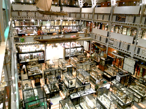
Pitt Rivers:
Wonderful as ever.
Ashmolean Museum:
A very well designed space and a nice place to have a walk around. I'm not mad into archeology but there were some great moments throughout the museum. The older part of the museum with the paintings in was entirely different in feel, more chambers and carpet and warmth than the informative, new, open space where you enter.
I really liked this quote in the exhibition about how the museum came to exist, (John Tradescant the elder to John Tradescant the younger to Elias Ashmole to The University of Oxford). On the cabinet of curiosity:
"I am almost persuaded a man might in one daye behold and collecte into one place more curiosities than hee should see if hee spent all his life in travell."
Design Museum: Terrence Conran
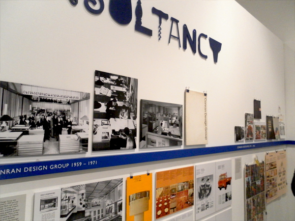
A superbly put together revelatory show which highlighted to me how much Conran has contributed and effected design in the UK.
Design Museum: Designers in Residence
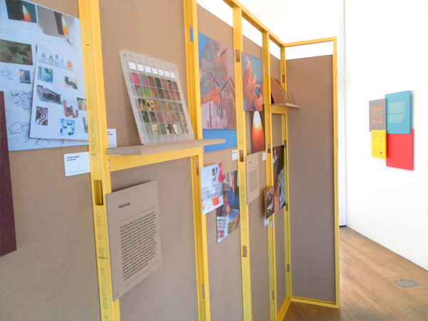
A really good exhibition design to this one. I particularly liked Will Shannon's reformed chipboard/concrete furniture.
British Museum:
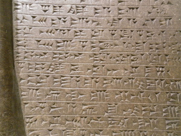
Classic museum going experience. Nice old stone.
June 2011 Photos
Dieter Rams
Wasn't sure I was going to enjoy the exhibition to be honest- I mean I know a bit about the guy and the designs but couldn't help feeling they were slavishly following a movement rather than doing there own thing and that they were plastic monstrosities created to be consumed and re bought with a different shell. The objects were however filled with an integrity and honesty which rendered a good majority of the objects still very contemporary looking. Of course some things dated- portable record players and some of the shavers and coffee makers. But alot of the audio equipment could have come straight out of Muji- and on reflection alot of the clean functionality which is characteristic of Ram's work for Braun can still be seen in Industrial Facilities work for Muji and others- (and if were going to name drop other contemporay people designing like that there's Apple to consider). I re-found Rams' 'Ten Principles of Good Design' and when you see some of the pieces it resounds very well. His universal shelving system is still on sale today and it really is a testament to the design that it looks so fresh.
1) Good design is innovative.
2) Good design makes a product useful.
3) Good design is aesthetic.
4) Good design makes a product understandable.
5) Good design is unobtrusive.
6) Good design is honest.
7) Good design is long lasting.
8) Good design is consistent throughout.
9) Good design is sustainable.
10) Good design is as little design as possible.
Design Awards 2010
Took a trip to the Design Museum and here's my round up of favourites from the Design Awards. The stuff shown is what I reckon is most awesome- there was of course some stuff that I didn't dig- but the following was so good I left feeling good about the Design industry which I hadn't expected. This is Sugru- a material which can be moulded by hand and cures at room temperature to become a washable, heatproof silicone. Sold as coloured lumps in various sizes it's designed for hacking your objects- fixing, making better and is generally just awesome.
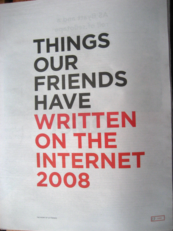
The Really Interesting Group (RIG) have created the Newspaper Club- utilising down time at printers they have created a service which allows individuals to upload artwork for their own newspapers of between 5 and 5000 copies- they've made printing incredibly affordable. Perhaps the most interesting (excuse the pun) thing which started it off is 'Things Our Friends Have Written On The Internet', a publication aggregating images and text from blogs, and websites into a printed publication. Heavy web 3.0 shit.
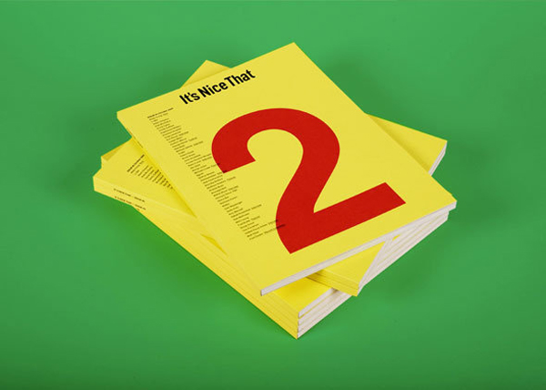
In a similar vain It's Nice That get my respect for producing a consistently quality package of blog, features, jobs board, exhibitions, artwork and most importantly for me an extremely affordable printed output: again, using the advantages of the internet to create content. Printing it turns it into something better- sort of brings it full circle.
Real Time by Maarten Baas is a clock which is changed manually- he's done a few- some with brushes, some as installations but this one is done with some red glass- black paint (I think I read it was latex) and a squigee. Watch the video. Not in the show but found on his website: I really really like his clay furniture series- I mean I really like it and I'm not into chairs.
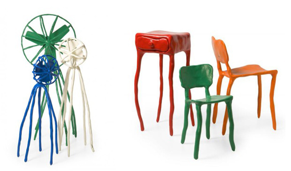 Also worth a mention were BBC iPlayer, Amazon's Kindle (Both of these were of going to happen, but are still well designed and pretty revolutionary), Why Not Associates Literary Forest, and The Trillion Dollar Project (to raise awareness for The Zimbabwean newspaper.
